Content-Heavy Website? The Ways to Make It Cleaner (While Saying Everything That Matters)
You’ve heard it many times that users don’t like clicking, scrolling and even don’t like reading. But what they definitely dislike is navigating through content-heavy and bulky websites. Your website is your business – it’s obvious you want to talk non-stop about it. Or write, or whatever other ways you may find to convey your message. Yet, poorly-organized content will affect its visual appeal. Often, it’s not even the size that makes your content bulky, but rather the way you segment your information and present it. Reducing your freshly-written content is always discouraging, so don’t hurry up to do it. Try visual and functional tactics instead.
You’ve heard it many times that users don’t like clicking, scrolling and even don’t like reading. But what they definitely dislike is navigating through content-heavy and bulky websites. Your website is your business – it’s obvious you want to talk non-stop about it. Or write, or whatever other ways you may find to convey your message. Yet, poorly-organized content will affect its visual appeal. Often, it’s not even the size that makes your content bulky, but rather the way you segment your information and present it. Reducing your freshly-written content is always discouraging, so don’t hurry up to do it. Try visual and functional tactics instead.
Typography – the way to design your words
The choice of a font, typeface and font size does have an impact on your content readability. But a few additional font adjustments are still necessary. Whether for titles, subtitles, or paragraphs, let your words breathe and make sure the distance between the characters and lines is big enough. Don’t use a bold typeface or at least reduce it to a minimum – it’s only making your descriptions look heavy.
The website is still bulky? A few more modifications are necessary.
Content hiding techniques and how willing are users to “learn more”?
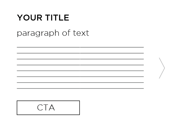
“Learn more” buttons might perform different functions depending on the pages they are used at. Let’s not talk now about a homepage where you mostly use these buttons to redirect the users to other pages, like “About us” or “Expertise”. We’d rather explain their functions on the internal pages, where “Learn more” buttons usually work differently. When your descriptions are too large, it makes sense to leave just a title, a few lines of text and a button that will open a pop-up window with a more extended description. Do not redirect your users to new pages. Instead, use a white pop-up without any distracting elements on it and let your users close it easily.
However, keep in mind that for the majority of users “learn more” buttons are often considered as the links to new pages which is why using them on the internal pages is risky. As an alternative, you could hide your content parts without redirecting the users anywhere or even opening pop-up windows. A simple (+) button will open a hidden paragraph of text on the same screen. This technique is highly useful for bulleted descriptions, where each point requires a more detailed explanation. When the user clicks on a different (+), the previously opened paragraph closes. Just see how it works:
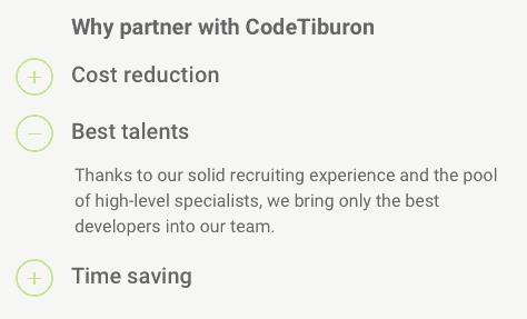
The so-called (+) buttons are user-friendly and don’t look too suspicious. Meanwhile, if you use “learn more” buttons on your internal pages, they have more chances to be treated as your attempt to redirect the users to other pages, even if you simply want to open a pop-up window for them or just show a few additional lines of text.
Another important aspect is that “learn more” and (+) buttons are not interchangeable. A text-hiding technique with the help of (+) buttons is only suitable for small-to-medium descriptions, while a pop-up window will be more helpful for larger descriptions. But before you choose between these two tactics, consider one more alternative.
Navigating between different content parts
A website is usually split into a few different sections. When you have a section that has too much information in it, divide it into some logical parts and let the user open these parts one by one.
Visually, it might look like here:
Visual segmentation of your content
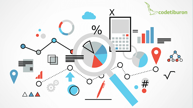
Probably the most visually attractive representation of your information is an infographic. Yet, it doesn’t mean that having one right on your website would look great. Instead, simply follow the approach that’s used in designing infographics. Square content boxes, arrows, schemes – they will only give your information a more logical flow (see the image below).
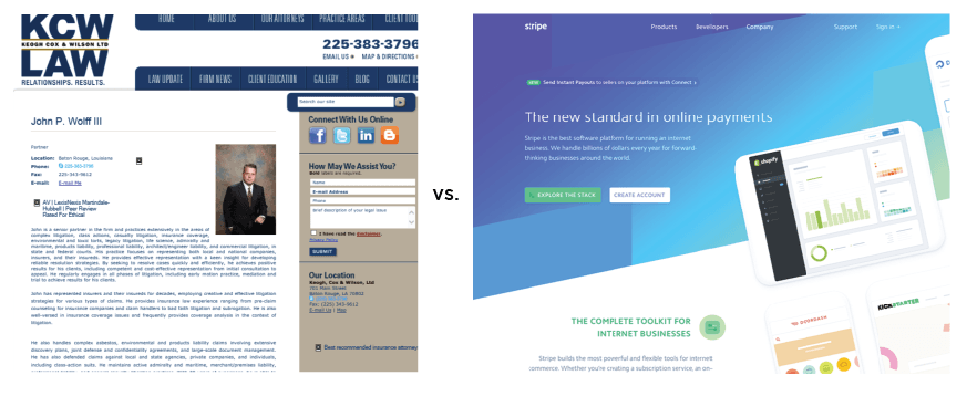
Where possible, describe your information visually and combine images with graphics. Instead of simply writing your text on a banner, think how you can convey your written message with the help of an image. A visual example is shown below.
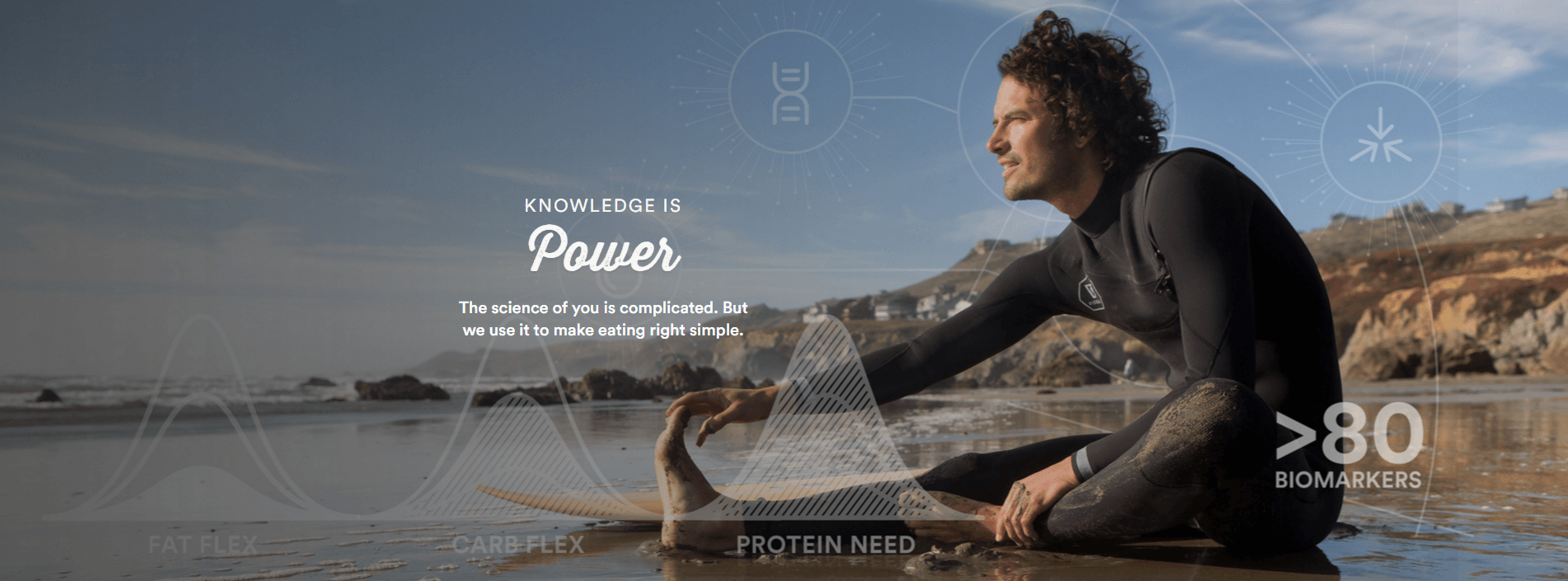
As a result, this banner adds a visual appeal to the website and also contains the information that would otherwise have to be written in a paragraph. Whenever you feel like you have too much written content on your website, no need to remove it. Possibly, it could be graphically illustrated and combined with any of your images. Yet, shortenings and modifications will be required here.
Visual hierarchy
When a website is designed, some elements are expected to convey more important messages than others. Follow the consistency between your design and written content. For example, when you have a bright background that attracts a lot of attention, it makes sense to place your CTA there. You cannot place big content boxes on images or bright backgrounds – it will only make your website look bulky. The more content you have in a section, the more sense it makes to use white as a background.
Advice to follow
Today, when everyone likes clean and uncluttered websites, the temptation to reduce your content descriptions to a minimum is only getting stronger. While for some businesses it is acceptable, others need to gain trust by means of detailed written descriptions.
Organizing their huge content pieces on the website then becomes a real challenge. Even though the above-mentioned content-hiding techniques might add some extra complexity in development, they are going to make your website friendlier and cleaner. Just share it with your designer or use these tactics when working on your website mockup and it should help you achieve a perfect content-design balance.