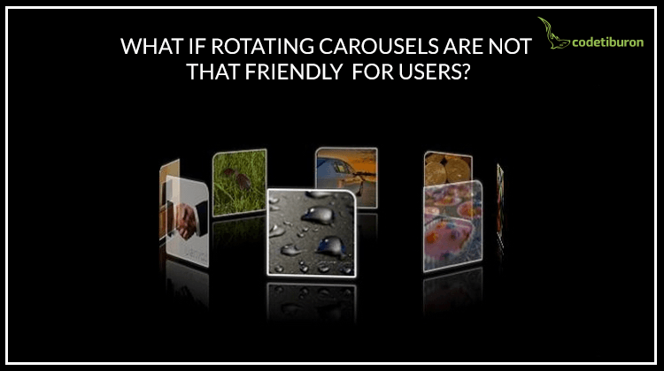
What if Rotating Carousels UI on a Website is NOT That Friendly for Users
The idea of rotating homepage banners spread across the web really fast. And it experienced tremendous adoption success. After all, having a multi-image slider on your website is a good way to show your key business assets without overcrowding the page with images and text. Basically, their key functions are these:
The idea of rotating homepage banners spread across the web really fast. And it experienced tremendous adoption success. After all, having a multi-image slider on your website is a good way to show your key business assets without overcrowding the page with images and text. Basically, their key functions are these:
- Showing your creativity in a few different banners within the carousel instead of just one
The top banner requires a specific design approach as it will be the first thing your website visitors will see. The more banners you have (three or four), the more chances you have to impress your potential customers.
- Gradually showing your business values in the order of importance
Carousel content is strictly prioritized. The first banner on your homepage carousel will be the one with the most important information you want to say. The next slide will reveal another company value or secondary service as the carousel rotates or as soon as the visitors clicked on it.
- Animations are not dead
Excessive animation effects on the websites will only affect its UX. And when users are confused or distracted, it will reduce their impression about the website. Fortunately, a carousel UX research classifies animated sliders among the friendliest website animations, if done right.
Then why are well-performing carousels so rare today? Mobile users are not at all happy about carousel usability. The higher the reliance on touch screens and mobile devices, the more difficult it becomes to streamline the performance of a carousel. Yet, here are a few key ways to make page carousels perform better on both desktop and mobile devices.
Auto-rotation speed
Users should have enough time to read through the information you display on the banner. Depending on whether it’s just one short sentence of text or a title with a subtitle and a paragraph, set the rotating speed accordingly.
User interactions
The majority of sliders stop as soon as the user puts a mouse over a banner. It enables reading all the information without any rush. But this feature is frequently ignored, which obviously affects user experience. In terms of mobile devices, hover behavior is not possible there, as you know. As an alternative, increase the auto-rotation speed so that you could be sure it’s enough to read everything without going back.
CTA’s on each banner
The main function of each banner on your slider is to persuade your visitors to take desired actions. A good-looking CTA that shows what exactly you want your users to do will only push them closer to taking actions.
No page carousels on websites? What about more user-friendly alternatives?
Today, when the design trends are so diverse and fast-changing, a carousel on mobile UX is a thing of the past, in a way. Don’t forget that creativity is the key value for doing business in the 21th century. Your customers expect you to be different from the other players on the marketplace. If you are not good at inventing things from scratch, consider some existing ideas that haven’t yet become too traditional and boring. Here is a selection of good alternatives to auto rotation you could consider for your new website:
Accordion
Even if it’s not as popular as a traditional rotating slider, it’s friendlier and more interactive for a user. Let’s say you have 4 main services that your company offers or 4 main values you want to showcase. If you choose to show them with the help of an accordion, it might look like this:
(slider is taken from younom.com)
Once hovered over, the image gets wider and some additional information appears. Accordion adjustments are diverse – you can make this image wider and the remaining three much narrower for example. The loveliest thing is that it is friendlier for touchscreen devices than a traditional carousel. One tap might open the image and another tap might click a CTA.
Boxed interactive banner
This approach is a good way to showcase everything on one screen (instead of 3-4 rotating screens). Let’s say, there are 4 services or key values you want to present to your visitors. Create a composite image of 4 different banners and place them on one screen.
To add some fun, they could all be sized differently. When hovered, each box could change its background color, open up some more descriptive text, or a CTA. In terms of being mobile friendly, it solves a number of problems that users have with auto-rotated carousels.
Video
If you have a nice corporate video that’s worth showing, why don’t you place it on the top banner of your homepage.
(banner is taken from habit.com)
As a result, it will not only get more views, but also boost your reputation in the eyes of visitors. However, creating a quality and high-resolution video takes time, cost and creativity. Make sure your video is ready to get into your homepage banner. If not, you can always count on alternatives.
Static image
Non-animated banner is not something to fear. Even one image can show more creativity than three of four together. It just depends on which design approach you choose and which message you decide to convey. A minimalistic banner with a catchy CTA can easily attract the desired attention and encourage a visitor to scroll down to learn more. Not sure what to place there? Highlight your current promotion or your top product.
Rotating carousels: to use or not to use
Control brings trust. Since self-animated banners are something that users cannot fully control, it affects your website exposure. A list of alternatives for carousels may go on and on. It just depends on how far your imagination can bring you. But one thing is certain – a website’s top screen is the key part that is responsible for your visitors’ decision to scroll down or leave. So if you’re looking for great user experience on your e-commerce website, make it clean, well-organized and professional. You might want to check out how to deal with content-heavy websites and sections.
Our list of homepage banner ideas should help you choose the most suitable option for your website. Can you think of some more? We would be delighted if you shared some in the comments.