Ecommerce Website Design: Modern Trends
Trends in web design are ever changing. And people judge your website right on the first visit. Whether it’s a bar or pizza shop, users still love things that are beautifully designed. To achieve a compelling eCommerce website, it’s essential to be aware of trends in web design. Meanwhile, it’s solely a web designer’s prerogative to transform these mainstream ideas into something unique and appealing. A fascinating look of your site is worth a thousand online sales.
To achieve a compelling eCommerce website, it’s essential to be aware of trends in web design as well as capable of transforming these mainstream ideas into something unique and appealing. Trends come and go. Some linger on for a while, others transform into something new, the rest – disappear forever.
Web Design is a fast growing industry. The ability to predict major directions of its development helps designers to make their projects remarkable. In this article you will learn about top trends of eCommerce website design in 2017.
If you want to create a stunning design for your website or to update it, then this article will not only help you get familiar with the lates trends in the field of web design, but also understand how to redesign your website. Do not let your competitors ahead of you!
We’ve tried to collect the most significant ideas as a wish list in which we presented features that every customer wants from their eCommerce website.
Flat design 2.0
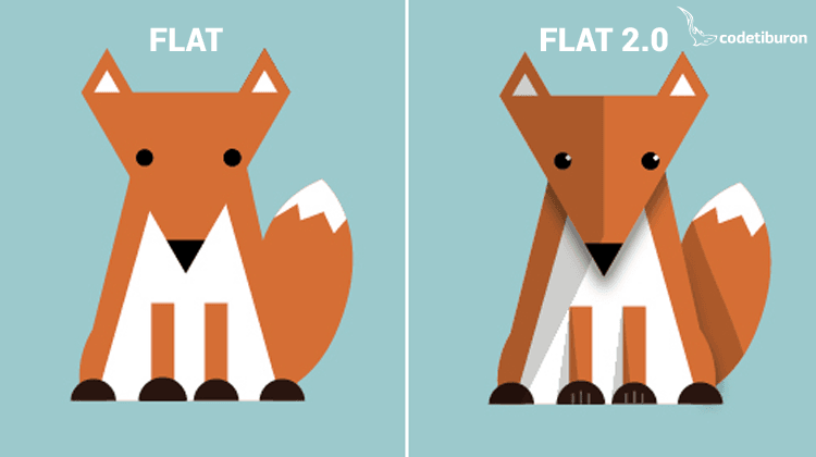
In modern design flat and minimalistic interfaces prevail. And it is more than just a passing fad.
One of the key advantages of a flat design is simplicity that helps make the interface more intuitive for the visitor. It works perfectly with modern proper framework and certainly looks outstanding. Now flat design starts to grow and evolve into flat 2.0.
Trying to keep the best of what is in the flat style, the designers prefer to strike a balance between completely flat and artistic – attractive to visitors. For example, it concerns the use of long shadows or reflections of objects, gradients, patterns, etc. As a result, over 2015-2016 flat evolves to “semi-flat” or “almost flat” design.
The main features of the trend:
- Long shadows add depth and complexity without sacrificing the minimalism that creates an attractive flat design. The shadow is insignificant, but at the same time it creates an additional visual interest.
- Dynamic colors. To make limited graphics look interesting, flat design usually uses bright colors and shades. This helps to place accents, and make it look less boring.
- Simple fonts. Flat design is supposed to contain fonts that are light and easy to read. Except for the logo of the brand identity in flat design, the same font is usually used on all pages. This prevents you from being distracted by the appearance of the page, helps to focus on the content, text-reading.
Fonts
Fonts play a crucial role in so much of an interface design.
Here are some guidelines to choosing fonts:
- For a website, it is better to use two font types, but you can use their different inscription.
- Use the fonts from the same family such as PT Sans or PT Serif.
- Do not use the same fonts for headings and body text.
- Using fonts with serifs for the header and fonts without serifs, such as Georgia and Arial, for the main text can be a good and simple trick.
- Increase the font size to focus on the essentials.
Impressive typography
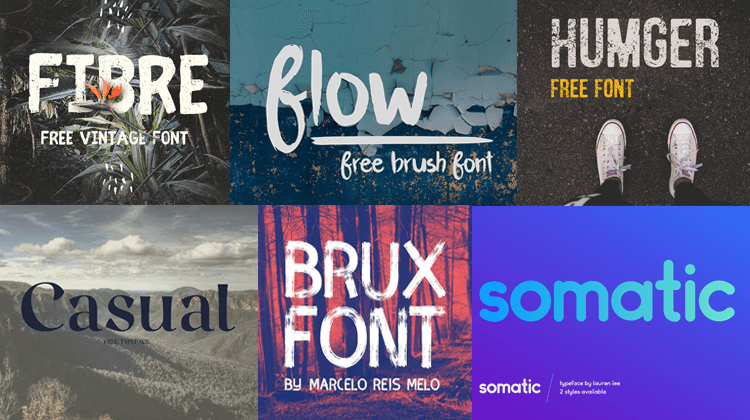
Web projects increasingly use great typography. Web designers make fairly strong statements by using beautiful and unique fonts. Font works are a central component of the development of web design and branding. In 2017, we can expect even more experimentation with artistic fonts on websites.
In 2016, the following three typography styles became especially popular: retro grunge typography, watercolor, all caps typography.
Retro grunge typography
Retro and vintage are in style nowadays. Designers are going for rusty style, grungy but luxuriant type option. Typefaces have a custom-made appearance and impression but not overly custom.
Most of typefaces are not from Google Fonts or Typekit, or might not be “superior” enough for significant websites. Usually the most fascinating designs are custom, single use artworks that don’t have many additional characters.
The secret to using a grungy or vintage typeface is by all odds modification. Choose one or a few words (it also may be a logo) and don’t use this typeface anywhere in your project. It benefits by being a single option.
Watercolor
Watercolor style is a soft trend that combines creative activity with an original sketch. This trend is all around. It is present in almost every component of design, for example, backgrounds, illustrations, and typography. Watercolor styles are attractive because they feel handmade and create extraordinary design.
Watercolor typefaces can sure enough be hard to use, because they incorporate different colors or might seem feminine. Perhaps choosing this style can create additional problems but if you are not afraid to take on the challenge, you will be very satisfied with the results.
A lot of watercolor styles are created with a brush script. It’s not a necessity though. To make it work, you should remember a simple rule: “Typeface loves thick strokes”. What it does is help the color to stand out.
All caps typography
‘All caps’ should be used very carefully so that it could add to the statement and not be a distraction. (This can be quite a fine line).
‘All caps’ can have a great effect with a minimal effort. Thin typefaces, condensed typefaces and even wider typefaces can all work effectively in ‘all caps’.
Use ‘all caps’ for display purposes, for simple and easy-to-read words and phrases, and don’t forget to include more space than usually around lettering to ensure readability.
Ghost buttons
These are the latest trend. Although it is not an absolute novelty, their use is still important. They are taking the web design world by storm.
A ghost button has a two-dimensional shape of a square or a rectangle with no fill and an uncomplicated outline. It can be entirely or almost entirely transparent except for the outline and text. The transparency of these buttons allows you to use them almost anywhere without compromising the overall design. They do not distract the visitor’s attention, but at the same time they are easy to recognize as a button. Ghost buttons are usually bigger than standard buttons on websites and are arranged in the center of the screen.
Ghost buttons can be seen on a number of various kinds of websites. This style of button is quite popular on websites that prefer to use full-screen photography, because this lightweight kind of button is designed to reduce the interaction with the image as compared to more standard button.
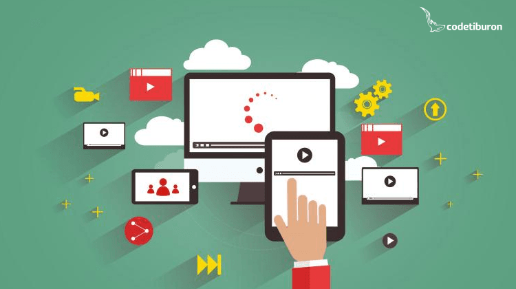
Full-screen typography
Flat design can significantly reduce the weight of the pages of the site or landing in general. This advantage allows to use static pictures of high quality and large size as the main image block (hero shot). And it seems that in the nearest future this trend will not go away. High-quality photos in full screen width can not only set the mood, but also affect the internal psychological experience.
Responsive web design
Possibly the most significant trend of the season is responsive design. Therefore, it is becoming increasingly important for mobile websites to be equally well adapted to smartphones, phones, tablets and other gadgets. Large buttons, affordable menus, great location information – all of these have to keep customers on the website as long as possible.
Mobile gadgets quickly evolve and they seem to have become an indispensable part of our lives. A designer’s main task now is to adapt products to the needs of users.
t makes user interaction with the responsive websites much easier. With a superior design, site navigation is simple to read, page elements are intuitive and content structure is clear.
Therefore, it appears that the responsive web design is not only a trend of 2016-2017, but a long-term future.
‘Sticky’ headers
The most recent web design trend is the use of fixed position mastheads, or “sticky” headers. They stay in one fixed position on the page while a user scrolls down. Some websites will also fix the position of other elements such as secondary navigation, social sharing links, or calls-to-action.
sthetic point of view, this is very beneficial – header files define the structure of the website and link all its elements.
But apart from the beauty of this innovation, there is also a practical application: now visitors do not need much time to find links to navigate the site – they are always in the same place. And besides, it’s extremely convenient for marketers: the most important pages and reminders are always in plain sight.
Interactive storytelling
People love stories. Moreover, people want to be participants in the story. Websites that tell a story can often engage users and play on something that evokes human emotion. Storytelling requires creating visual and user interface components to create something that humans want to interact with.
Therefore, try to tell the story of your brand, which will make the users follow through. Use interactive tools for engaging and intriguing questions, to entice the visitor to click, to scroll and to read.
Infinite scrolling
Following from storytelling, come long scroll websites which can often be interlinked.
Take a look at Google Images or Pinterest. Infinite scrolling has become popular alongside mobile devices, it allows users to easily see more information with a flick of a finger which they prefer to a push of a button.
Long scroll websites allow users to be taken on a journey. With storytelling being more relevant than ever, long scroll sites are not going anywhere just yet.
Conclusion
The hot themes in eCommerce website design are minimalism, custom made typefaces and responsive web design. It takes beautiful art, an interesting story and plenty of planning to succeed. Can your site boast of any of these features? Which trends do you follow? Share your answers in the comments below.