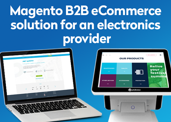
Magento B2B eCommerce solution for an electronics provider
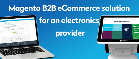
- Custom POS module development
- Light and clean website design solutions
- Agile collaborative environment
Context
Client
A Belgium-based B2B ecommerce enterprise was looking for a vendor to outsource certain design and development functions of building a Magento webshop.
The challenge
Since business analysis was completed predominantly on the client’s side, the requirements were restricted to the design and development and a lot of change requests concerning the previous development. The major challenge was the limiting conditions in which testing and deployment were on the client’s side while development – on the vendor’s side, which added an extra layer of uncertainty and back and forth.
Solution
Design
Our primary objective was to design lightweight and clean user interface, devoid of unnecessary details that may distract the webshop clients. The UX was aimed at reducing the noise and obstacles on the way through the buyer’s pipeline. The key elements, like header, footer and site frame, were to be redesigned to give more space.
Magento CMS supports different user roles, and this peculiarity had to be taken into account in the design implementation. Since not all elements are visible for every role, the page layout would be different.
UI & UX elements
The website
Usability asked for improvement, in particular, the following elements were redesigned, enhanced, or created.
- Site homepage – was to perform a dual purpose: to an unlogged user – to the company introduction; for a logged one – the header is altered to give space to other information; to make all the logos more visible and alter the look of some elements.
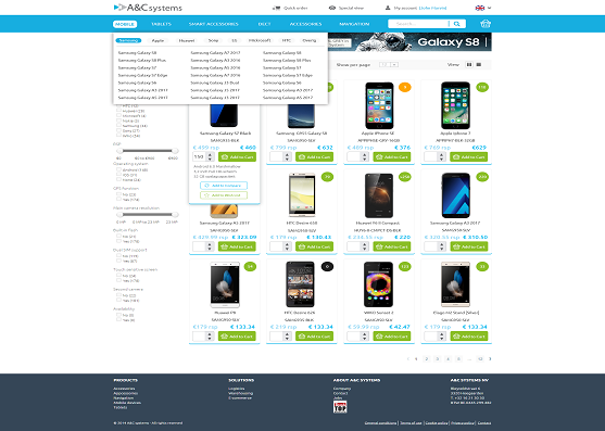
- Product lists – underwent major redesign the way it aligned elements visibility with different user roles. We altered a special view mode for each product, a user account view, grid and excel views of the listings and more.
- Product detail page – needed formatting.
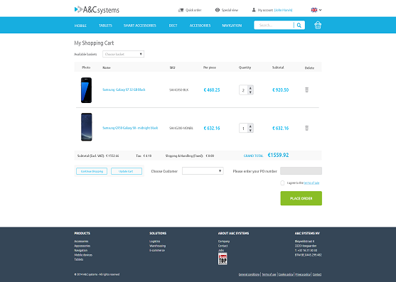
- Shopping cart page – general layout redesign.
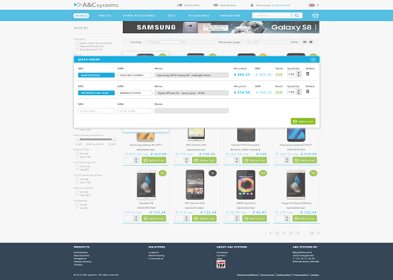
- Quick order form – we designed an overlaying screen where a user can enter product SKU (stock keeping unit) or barcode so that s/he can add it to cart in bulk.
We added other convenience elements, like comparison and quick order pop-ups. Designing around an existing solution can be pretty demanding.
POS
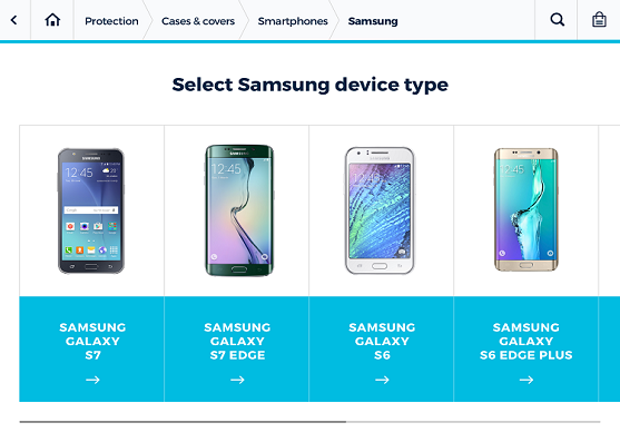
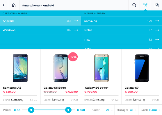
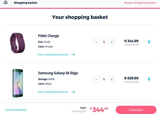
Mobile & tablet versions of the POS system display the products in stock and lead a customer through the buyer’s funnel. The following POS module front-end elements underwent alteration and redesign:
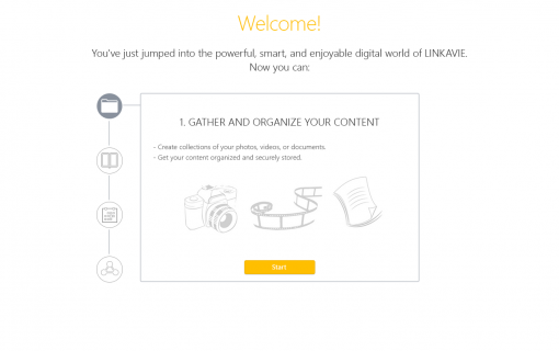
- Splashscreen
- Homepage
- Login page
- Accessories’ funnel screens
- Search
- Search results
- Filters
- Subcategories
- Shopping cart
- Cart landing pages
- Product detail pages
POS module development
This internal-use system binds the terminals with the master PC and the cash register in brick-and-mortar stores. It allows the customers to place an order via the terminal, which automatically generates a key and sends it to the cash register for a faster transaction.
Our business partner made a special point of having no 3rd-party software. We designed and developed a custom system to meet the specific needs of a large online B2B vendor. Among other features, the system had to support a lot of administrative functions:
- inventory maintenance
- purchase orders
- time clock management
- credit card settlement
- global price changes
Read also: Ecommerce Website Design: Modern Trends
Results
The client appreciated our designs. Our efforts in developing an intuitive POS system proved a success. Our partners appreciated its simple and efficient architectural design. We had a great learning experience working in the collaborative environment of ProjectPlace.

