Having a problem of delivering a product that your target audience will actually love? MVP is a solution for you! It lets you pick inside a user’s head and see the work he has to get done, his headaches and the gains he needs. This will give you the vitally needed feedback loop and provide both you and your customer with control over the product. You can learn and make changes instead of just following the plan and hoping for the best.
Use the plan to learn how to create a great user experience for your MVP.
The minimum viable product definition
An MVP (a minimum viable product) is a way of narrowing down your idea to the smallest amount of stuff online that validates your assumptions. It can be the earliest, smallest, testable thing that can get a customer to register the need, test the solution, and give you feedback. The ultimate goal of creating an MVP design is to learn if your product fits the market and how you can make it a better fit.
Do not let the word “product” fool you. Contrary to popular opinion, it’s far from being a product yet – just a minimum set of features. It is a process that either proves or refutes assumptions about a business idea.
The MVP process consists of the following steps:
- Determining who will use your product. Give your potential customer as much textured storyline as you can, before you get to the actual process of figuring out how they get through some kind of the MVP UX design flow at the other end to actually getting the product.
- Finding a problem worth solving. Think about the pains of this particular type of customers and how your product can help.
- Determining the smallest possible solution. So now we put the ‘M‘ in MVP. Take a closer look at your product with various components that the user might go through and minimize it to the point of the smallest possible solution.
- Measuring. As we have said earlier, an MVP is a process, and to get results, you will need to measure the performance of your product, so you could collect the maximum amount of validated learning about customers.
Why every business needs an MVP
Why it is so important to create an MVP?
You probably keep pondering on the question. Not to worry! In a few minutes, you will have the answer.
An MVP is an important component of your business strategy. With a simple version of your product, you can test business concepts and see how it behaves on the market. It will allow you to collect customer data, get your product to market quickly, and keep costs down. It is much better than creating a big useless thing because if you build too much, you will have no idea what makes people love the thing that you’re building.
A successful MVP design can bring investors to your idea. If done correctly, a minimum viable product shows the product’s strengths and attracts investors to its development.
An MVP lets you build up a customer base and collect insights into what works and what doesn’t. With these data, the future iterations will be exactly what your target audience desires.
To sum up, developing an MVP lets you start small and gradually create a product of better quality. With each version of the product, it evolves to maximize a return on investment.
To create an awesome MVP, you should consider using one of this five main UX strategies that are effective in helping teams answer this often challenging question ‘What should we build first’.
Painkiller

If your product is designed to eliminate or completely remove annoyance or pain of a customer, this can be a way for you. The entire MVP can consist of one pain remover. A Painkiller strategy is focused on creating a single feature that resolves a high priority problem at the lowest cost.
For example, it can be a program that simplifies and automates some kind of time-consuming work. As a result, you’ll gain trust with end users and allow developers to make appropriate changes in the technology of production. This strategy does not require the MVP to represent a whole product but still can be measured.
Fast money

This approach is best for products or services that require some way of payment from your customers. It is the fastest path to revenue. The first thing you need to figure out based on your core revenue model is what exactly users are paying for. Ask yourself, ‘would they still pay for the product or service if it was removed’. If yes, cut off all the features of your product or service. With this strategy, you not only have a powerful test running but also get revenue.
Wizard of Oz

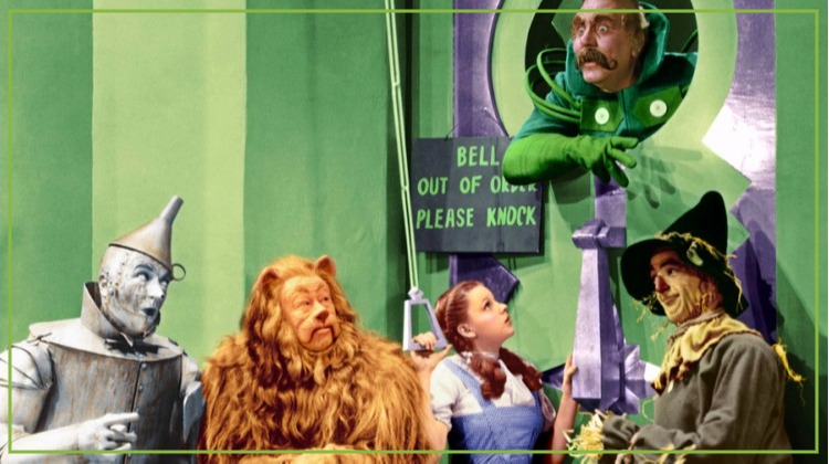
Remember the legendary musical film from the 30s, The Wizard of Oz? Remember when the Wizard is exposed as a normal, old man behind a curtain? Just like this fairytale story in the Wizard of Oz approach, it will be you who carries out the product functions manually, while the users believe that it’s really working product. But remember, it does not mean that you deliver a fully customized product or service to your customers.
You can apply the Wizard of Oz strategy to verify if the users are willing to pay for your product or service and to learn how many are buying it. With the actual quantitative sales data at your disposal, you don’t go use guesswork or market research reports, but your very own personalized data – the number of orders you got and the price paid by each customer. You may try to satisfy just a few customers at the start. Validating the demand potential is not all. You’ll also learn from the customers’ feedback and gain hands-on knowledge about what makes your business run smoothly. It’s all about learning fast by making one sale happen manually.
Go ugly early

This strategy of an MVP software design is a great option for products which require some engineering process, or in which a key product risk is technological. For example, an ordering system whose primary task is to connect with parts warehouses all around the world.
This approach can be hard on the UX side of the problem because it focused mainly on technology. It could be a kind of oversimplified GUI or even a command line interface. The strategy determines whether the technology will actually deliver without getting distracted by UX issues.
Fake it till you make it

For this approach, you need to put yourself in the world of pure imagination. So, the strategy requires you to use imagination to the fullest. Before actually building a product, picture it as if already made and then create a marketing page for selling it. Let’s just say it is like a storefront without an actual store, that gives you the information about how many passersby are interested in coming in. With a metric like how many people will sign up to purchase the product, you can find out what type of market is suited for the product. In the case of a low level of signups, you may want to change the marketing page message and instantly see what impact it has. This gives you insights into redesigning your product in alignment with your marketing page promise.
Why is user experience design important
What is user experience design? What does UX mean for an MVP? UX is a process of enhancing user satisfaction by improving the usability, accessibility, and pleasure of the ‘user – product’ interaction.
So you may ask, ‘Is user experience design important?’
Absolutely! For all users of products and services. Unless a product isn’t designed for users, they won’t use it. Would you use a texting app that doesn’t let you text easily or is annoying? NO! But if you do design an MVP for users, and you do get it right, this means you can create strong, positive relationships between the product providers and end-users.
To create a true user experience, you need to answer these three questions:
- Who is the customer?
- What are their challenges?
- How can you solve them?
Remember, it is a USER experience, so you need to answer questions that your typical user might have, like:
- Is this for me?
- Does it work?
- What is it exactly?
A core UX principles in the MVP are based on the “M” in the MVP.
- Users should go through a minimum of steps to get your MVP.
- They shouldn’t experience any problems while doing it.
- The MVP UX design flow should be as simple as possible.
- The user interface shouldn’t be overpowering, try minimalistic MVP app design and highlight the MVP features.
What are the components of an excellent UX for an MVP
Nice and simple visual design
Visual design uses images, color, typography, and shapes to improve the MVP UX. With a minimum viable product design, there is no need for cutting edge approach, it should be nice and simple, and based on the principles of visual design such as unity, balance, hierarchy, proportion, emphasis, and contrast. It can visually increase the value of the product to a user, ensure recognition of a product, produce a good first impression.
Here are some tips on how to improve the visual design:
- White space. White space is not necessarily white. It is just an empty space between the elements on a page. White space frees your content and makes sure it is noticeable.
- Animation. Animation is designed not only to entertain a user but also to help him/her understand what is happening and how the website works. Loading should not be boring. You should always try to make the waiting time more enjoyable. But do not go overboard here, remember simplicity.
- Symmetry. Balance the layout of your content. It is more appealing to a user if divided into even, symmetrical parts.
- Flat design. It helps to make the interface more intuitive for a visitor with a minimalistic MVP application design. So you can make it clear that you are offering just to develop an MVP.
Use an onboarding screen to show your unique value
Onboarding screens are the ones shown in a sequence that a user sees when he opens an app for the first time. It is very important for MVP app design. It usually contains three or four screens with the explanatory information about your product and how it can solve their problems.
Note:
Users get to often skip an onboarding screen. So in order to bring their attention, use a simple and scannable text that comes with a minimalistic visual design.
Try to connect with customers on the emotional level. Here illustrations and photos can become really useful. Remember, a well chosen picture can speak volumes.
Welcome your users and walk them through
With a short and simple tour, you can tell your customers everything they need to know about your offer – a product or a service. It can be really useful if you invented a new unique concept or a niche product. Walk the user through the process. The ultimate goal is to make the user feel like they have grasped the concept.
Educate customers about your product and give them a taste of what they will get by investing in it.
Manage a micro-feedback
As we have learned, an MVP is a process. So in order to keep it going, try to implement a micro-feedback form. It will really help to know what users say right after they tried your product or service. Ask a simple question like, ‘Please, rate our service from 1–5’. Don’t use a giant survey that will most definitely scare off customers. For example, Uber asks you to rate and comment on the driver right after the car ride.
Next time you iterate, try out this information to perfect your product.
Want to find out how to create an MVP in Software Development? Check this article:
Minimum Viable Product in Software Development: Getting It Right
Conclusion
Now you know the answer to a question “How to make an MVP?”. An MVP is an important part of every successful business. Do not skip this step while creating a product or a service. Remember to design MVP for users, and you are sure to get it right. By creating an MVP, your products will become more relevant to the customers. Using an MVP, you create solutions tailored to the users’ needs. And now you can make them an offer they can’t refuse.

