20 Potent (Not-too-Top) Secrets to Craft a Killer Landing Page That Converts
You’re working 24/7 on your brainchild and put off creating a landing page. A lot of new businesses are like that – there’s no time to waste on silly landing pages. They’ve no resources to spare. But then comes the sweet moment to tell the world about your product. And with it, a host of questions. How to craft a page that converts? How to setup the process? What are the best design and copywriting practices? What to test? Let us spare your precious time and unveil some potent knowledge of creating a powerful landing page.
You’re working 24/7 on your brainchild and put off creating a landing page. A lot of new businesses are like that – there’s no time to waste on silly landing pages. They’ve no resources to spare. But then comes the sweet moment to tell the world about your product. And with it, a host of questions. How to craft a page that converts? How to setup the process? What are the best design and copywriting practices? What to test? Let us spare your precious time and unveil some potent knowledge of creating a powerful landing page.
The post addresses four areas of a landing page (LP) creation:
- Process setup
- Design
- Copywriting
- Conversion rate optimisation (CRO)
| PROCESS SETUP |
|---|
| - #1 Mimic development process - #2 Research buyer personas - #3 Start small |
#1 Mimic development process
Any product development has four stages:
- discovery: when you research, learn and adopt;
- planning: developing a program plan and test strategy;
- execution: designing and launching conversion-focused experiences;
- analysis: when you measure, analyse, share knowledge, and plan changes.
Creating a landing page takes the same approach. You start by discovering:
- your target audience (TA): their pains, their ways, what they know, what they want – all the details to create buyer personas;
- the market – to determine your unique value proposition (UVP), how you can help and what you do differently;
- your competitors – learning their ways and tricks, successes and failures;
- current LP design trends – to do better and become a trendsetter.
What you learn helps to strategize and plan:
- goals
- UVP
- metrics
- buyer personas
- a visitor’s desired behavior
- the definition of conversion
- test strategy
The last part – execution, analysis, and bringing it to perfection – is a matter of practice and mastery of a few secrets that we’re going to reveal shortly.
#2 Research buyer personas
Low conversion primarily stems from focusing on the wrong audience. Knowing your TA in-and-out is crucial. And also hard. Neil Patel lists the fundamental demographic information you need to collect:
- age
- gender
- education level
- income level
- geographic location/size of community
- marital status
- size of household
- racial/ethnic identity
- occupation
- number of children
How to research buyer personas? Before you can reach out to them and ask directly, there are two ways.
For someone with an established online presence, the tools like Facebook Insights on your corporate Facebook page and Google Analytics Audience Reports will do a great job.
If you’re just beginning online, get insights from your competition activity by analysing their traffic via services like SimilarWeb or Compete.
#3 Start small

Many entrepreneurs run against the same stumbling block – they overthink their initial strategy. The truth is, no matter how well you think it out, your first draft belongs in the bin. So the strategy ‘start small, fail early’ works best. But don’t dump your old design just yet! Test it. Apply the ‘lean startup’ logic: build a minimum viable landing page. Then measure – learn – rinse and repeat. That’s exactly how Kellogg’s achieved a 230% conversion rate increase and a 40% time-on-site rise.
And that’s what Mark Zuckerberg meant in his graduation pitch saying ‘Ideas don’t come out fully formed… they only become clear when you work on them… you just have to get started’.
Overthinking has killed many a brilliant idea. And it’s always better to get it wrong today than perfect too late.
| DESIGN | ||
|---|---|---|
| Layout | Elements | Interactive design |
| - #4 Above the fold - #5 Familiar layout - #6 White space - #7 Encapsulation |
- #8 Top quality imagery - #9 Motion design & video |
- #10 Opt-in forms made just right - #11 Directional cues - #12 Mobile-friendly |
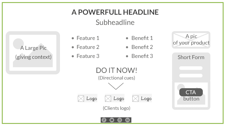
#4 Above the fold
The top 600 pixels of your page matter most – that’s where you put the crucial elements:
- your logo
- the headline/subheadline with a UVP
- bullet points with features/benefits
- your picture/video
- the CTA button
- the opt-in form
SEO experts may frown on that because if all the elements are on the screen, no scrolling is needed – not so good for your page SEO ranking. Away with rankings! A landing page is not like any other page on your site. Its sole purpose is conversion.
#5 Familiar layout
It’s not the best moment for reinventing the wheel. Familiarity of the layout is about placing the right elements in their proper places. This quick 7-minute video gives a clue how european users prefer the elements placed.
Of course, other cultures with their idiosyncratic reading patterns and general perception may be used to different layouts. For instance, one study discovered Americans were more foreground-focused whereas the Chinese primarily fixated their eyes on the background.
Our sense of familiarity arises from the fact that screen scanning follows certain regular patterns. Eye-tracking studies distinguish two basic ways – F-pattern and Z-pattern.
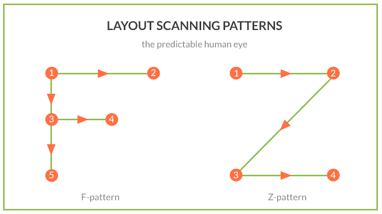
With content heavy pages, F-pattern is a better option, while cleaner pages are more biased towards Z-pattern.
Keep cultural differences in mind when targeting your page at a particular demographic. An unfamiliar layout may leave your visitors confused or distracted from the key massage. Familiarity, on the other hand, ensures a smooth tractionless transition. A page is no longer a page, but an experience as a visitor propels through the funnel in her personalized buyer journey.
#6 White space

Naturally, you want to talk about your product day and night – to show, impress…
Don’t! Make it short. Keep it simple. And let them ask for more.
No matter how brilliant the design, the importance of empty spaces can’t be overrated. What they do is:
- create focus – nothingness lets us focus on somethingness;
- categorize – by the law of proximity, white spaces help to cluster related elements and distance unrelated;
- remove clutter – so we can glide smoothly and absorb more information;
- give us a break – empty spaces put our mind to rest.
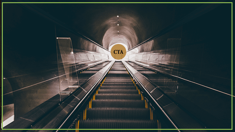
#7 Encapsulation
Another attention-driven design technique is encapsulation. Together with the white spaces, it makes important elements protrude by encasing them in boxes, contrasting colors and shades.
What elements need wrapping up?
- The CTA – that’s why it is always a button, oftentimes of a contrasting color.
- The opt-in form is also a different color and stands out from the background. It can even move independently, hide and pop-up or stay glued to the screen whenever you scroll.
More often both these elements are placed in one container. That creates sort of a tunnel vision – as if you peer through a window to see the faraway call to action – and nothing to distract you from taking that action.
#8 Top quality imagery
Why does professional photography matter? Humans are visual creatures and our aesthetic ego craves beauty and style. Photography with style extrapolates its quality onto the brand. Since visual information takes less time to process, your site is likely to stick in a visitor’s mind as professional and credible.
Another important reason to splash out on photography and design is SEO. How to make a site searchable in the first place? Google takes a different approach to visual content compared to other types. Images are assembled in clusters of similar items and then the best representative is given a better rank in the Google image search. With the tough competition of e-commerce sites, image optimization is no joke.
Mega-large images? Great! Optimize.
When it comes to visuals, the rule of thumb is ‘show more’. Detailed product photos, 360° rotating images, mega-large shots of your product in context increase conversion rate.
That said, however, mega-large images ask for a word of warning. Large-sized quality photography weighs a lot – and page load time can be a major conversion-killer, especially for WordPress – a mega-large image enabler. That’s one of the major mistakes novice website owners make – uploading large images directly off their digital cameras and using WordPress image resizing functionality to display a smaller version.
Don’t fall into the trap of editing large-sized images in your browser! Instead, before loading, remember to optimize your images for the web in the editor. Here’s how you do it in Photoshop:
- Choose a ‘Save for Web’ option to optimise the file size with top quality in mind;
- Save in PNG format with simple decorative images;
- Alternatively, lower the quality to ‘medium’ or ‘high’ for JPEG format.
The best format for detail-packed ecommerce images is JPEG, but try to keep the file size below 70 kb whenever possible.
But how can you showcase essential minute details of your product? Here’s how – ZOOM. Image Zoom is a 5-star WordPress plugin that allows you to create a magnifying glass on your images using admin panel.
Dig deeper into image optimization with this article.
#9 Motion design & video
You’ve seen it a thousand of times: you land on a page and the video comes alive; you scroll – and the objects start moving – floating in and out of view. Web page animation is trending. And you can breathe life into your landing page in a variety of ways:
- Animated GIF images, short simple video-like sequences of raster graphics.
- Cinemagraphs are not the regular GIFs as we know them. They’re partly animated. As the name suggests, it’s a blend of still and moving elements – or rather a still frame with some area set in motion.
- SVG animations – allow you to animate any element on the page – be it the menu icon, text, infographics, directional cues, or your logo. Used to create various page loading effects.
- Parallax scrolling – background and foreground semi-transparent images moving at a different speed, which creates a 3D effect. Includes multi-layer and video parallax.
Use animation to:
- Demo how a product works
- Explain a concept
- Add style
- Tell a story
- Direct your audience
- Create a visually-appealing loading experience
The power of video is undeniable. And not without reason:
- watching a video takes longer than scanning a text – so you win some time for your brand message to sink in;
- high-quality video featuring your company staff gives you credit;
- video content is easier to grasp;
- it’s more entertaining and engaging.
Landing pages employ video format for various purposes:
- Silent video backgrounds;
- Product demos;
- Customer testimonials.
Given the impact of video content on conversion rate and brand promotion, we can expect its long-stay on landing pages.
#10 Opt-in forms made just right

Crafting an opt-in form will send you in Goldilocks’ pursuit of an ideal bowl of porridge, till you find what is just right for your site.
It’s widely agreed that longer forms kill conversion. In fact, one study cites a 34% conversion rate increase due to cutting the form’s length by half. Another research by MarketingExperiments showed a 300% conversion rate boost due to reducing the number of fields from nine to three.
But don’t rush to delete your long forms yet! You may need various info for different campaigns. How to get all you need and not to deter your visitors? A simple trick – progressive profiling.
Let me explain. It’s akin to dating. You don’t give your date a third degree on your very first night out. Instead, you’ll talk less, listen more, and tentatively feel for some points of contact. Progressive profiling is just like that. You gather information over time and continually update the prospect’s record. For example, why not start by eliciting basic information:
- First Name
- Last Name
- Email Address
On the next session, adjust the targeting by asking for:
- Role
- Location
- Employees
Finally, to qualify the lead, replace the form with the one asking for:
- Phone Number
- Timeframe to purchase
However, cut the tactic to your needs. For example, if a first-timer asks you for a quote, their name and email will say nothing about their project or reasons for contacting you so you can adequately and promptly reply. Your form has to provide quality information to anticipate the communication needs. Multi-step forms need split testing. Vary the length based on a persona type or your visitor’s behavior on the site.
#11 Directional cues

When a landing page is designed, all elements are laid out to conspire for a viewer to ‘take action’. And even though a good design is inherently intuitive, which means you never have to say “Click here”, with landing pages a little bit of prompting can make a big difference.
Directional cues – both explicit (arrows and lines) and suggestive (imagery, contrast, spacing, asymmetry, encapsulation) perform a variety of functions:
- Arrows and all sorts of suggestive cues like eye direction or pointing guide visitors towards strategic areas like a CTA button and opt-in form;
- Vertical lines and arrows also indicate there’s information below the fold so the user needs to scroll down to see it;
- Progress bars indicate progression in multistep processes like form-filling;
- ‘Learn more’ notifications help lighten content-heavy pages, yet say more.
Why do we need them? For two reasons mainly:
- A web page is not read like a book – so guided reading is a must if you want your visitors to convert.
- A mobile page is laid out differently and needs additional scroll cues and navigation markers.
Like with any other LP elements, directional cues should not be taken for granted. Test to see what works for your audience and don’t expect a universal recipe.
#12 Mobile-friendly
Being mobile-friendly does not stop at responsive design but extends as far as:
- device compatibility and layout
- usability
- performance
- CTA hierarchy
- copy
- device and location awareness
- finger and thumb friendliness
- contact method friendliness
- company, contact, social proof
- forms optimisation
And even the term ‘responsive’ itself is often misused so that a design may be technically responsive but its visual hierarchy completely broken, with non-scrollable pages devoid of directional cues. Mobile landing page optimisation is a separate area of knowledge, which can’t be ignored today. That’s where personalization comes to the fore. Not testing the checkpoints above on a variety of devices is like robbing some of your users off their valuable experience – totally inacceptable as regards landing pages. As Craig Sullivan puts it, ‘Experience the stuff you build using their devices, their context, their network connections and knowledge of their goals, tasks, fears, worries and barriers. Don’t tell me the experience is good — please go ahead and bloody prove it!’
#13 Craft a complete buyer journey
Marketers know that the purchase process is a journey. Initial creation of buyer personas is only a job half done. A new challenge is working out a proper buyer’s journey. That’s the way your site, and the LP in particular, sends your visitor down a conversion funnel – it interests a stranger, informs them well enough, invokes a desire to take action and ensures smooth and easy conversion. The more relevant a copy, the better chances they will stay with you throughout the journey. But leakage and drop-off are always near.
People bounce off a page that:
- doesn’t offer a next step in any of the stages;
- doesn’t communicate the benefits of your offering in the Interest or Desire stage;
- doesn’t use strong calls-to-action in the Interest or Desire stage;
- has a complicated Action stage.
How to craft content that converts? Read on to find out.
#14 Cut the fluff
When it comes to online reading, most people just scan a page. A research suggests that only 16 percent of people read web pages word-by-word. Moreover, only 28 % of words are read on an average page. So a copywriter has to strip the copy to bare necessities.
But that’s not it! Check if your copy is:
- Scanable
- Simple
- Relevant
- Tight
- One-goal
#15 Tell a story

Copywriters know how to write a copy that sells. Hollywood has taught us how powerful and fascinating stories can be. Want to know more? Brian Clark has a clue:
- Know your audience: if you know your buyer personas and address their pains in their lingo, you sound more authentic;
- Select your frame: use familiar concepts and situational frames – and your story is bound to resonate with what your true audience believes in;
- Choose your premise: the hook, the purple cow (as Seth Godin puts it), or the way your story stirs action – is what differs the good and the great.
Stories are compelling because they:
- are easy to relate to;
- are highly memorable;
- invoke emotion and action.
#16 Scent & message match
What exactly is a scent & message match? It’s best explained when the opposite occurs – a mismatch, which is inconsistency of your PPC campaign ad copy and the corresponding LP. More precisely, when the look and feel of your LP does not live up to a visitor’s expectation.
What happens when your ad is not consistent with the corresponding landing page? Visitors leave. That’s just the opposite you expect them to do, right? That means trouble and we need to pinpoint the mismatch.
But how? Test variations of copy continuously. It’s not difficult: with some tools like Unbounce, Wishpond, or LeadPages it takes less than half an hour. Revise you headlines/subheadlines and the overall copy – adjust the wording or style, tighten the message, change the promise. It’s not the right moment to test your eloquence, though.

Staying simple and to the point is the best policy. Don’t let your visitor brush through your conceptual metaphors bearing loose connection with your original pitch. In fact, you may just take a simple path and make your ad copy match your landing page copy – verbatim. Creating a specific landing page for each variation of your ad also helps to avoid mismatch.
#17 Impactful headlines
A headline is the first thing to notice on an LP. If it doesn’t engage a visitor, they will probably leave. You have just a few seconds to form the right impression.
How? Expert copywriters recommend this:
| Tips | Examples |
|---|---|
| Communicate value – make yourself useful, address your readers’ pains, fears, desires. | ‘SICK OF COLD CALLING? Learn 13 ways to generate an endless supply of hot, qualified leads – and never cold call again.’ (nevercoldcall) |
| Be ultra-specific – throw in numbers and exact names. Being precise instills trust. | ‘MORE THAN 300 NEW TRICKS & TREATS like you’ve never seen before’ (grandinroad) |
| Be urgent – set time limits. | ‘Learn How to Get More Dated Today’ (theprofessionalwingman) |
| Simplicity is the key – don’t be too clever. Follow the 4 C’s rule: Clear. Concise. Compelling. Credible. | ‘IT’S BACK. Gear up for football in styles from the sidelines.’ (fansedge) |
| Observe the rule of one – focus on just one idea or one buyer persona | ‘MOBILE BANKING FOR CREDIT UNIONS’ (bankjoy) |
| Focus on loss aversion – show what your visitor may miss if she doesn’t buy your product. Appealing to a reader’s fears is a powerful technique. | The benefit of moving from free to paid may be ‘DON’T LOSE THE DATA YOU’VE ENTERED’ rather than ‘SAVE YOUR DATA’. |
| Use imperatives: basic forms of action verbs qualify like CTA. | ‘SIGN UP FOR YOUR FREE WISTIA ACCOUNT’ (wistia) |
| Give a sneak preview – a taste of the product. Add some energy. | ‘This Will Change The Way You Watch “Big”’ (clickhole) |
| Ask a question to make people think. | ‘HOW MUCH IS YOUR HOME WORTH?’ (trulia) |
| Make it personal. | ‘LET YOUR SPACE INSPIRE. Custom floral subscriptions for your home’ (h.bloom) |
| Keep it short & sweet. | ‘EXQUISITE DESIGN. Custom Arrangements for Businesses’ (h.bloom) |
| Use an epithet. | ‘BRILLIANT. INSIDE AND OUT. Smarter ways to connect, create and share. Make a sleek and stylish line of Galaxy Smartphones the leader in next-generation mobile devices.’ (samsung) |
| Surprise, shock, intrigue! This works well with ebooks and webinars for people advancing on a subject and willing to get a transforming experience. The headline will whet their appetite for more. | ‘Larry Kim Presents: Everything You Know about Conversion Optimisation is Wrong’ (wordstream) |
| Formula ‘Problem – agitate – solve’ | ‘TrueVault is the secure data store built for the enterprise.’(truevault) ‘Working with other people? Struggling to keep everyone on the same page? It’s time to try the Basecamp way’ (basecamp) |
| Formula ‘Features – Advantages – Benefits’ These three may be go in different order, sometimes omitted. | ‘HIRE GREAT PEOPLE. FASTER’ (fastcompany) ‘Lean Content Marketing – Do More with Less!’ (marketo) |
| Formula ‘Before – After – Bridge’ | ‘INTRODUCING FINAL. Never hassle with fraud, theft, or cancelled cards again’ (getfinal) |
#18 Irresistible calls-to-action
A perfect CTA is always in accord with your LP content and design. But that doesn’t mean there are some universal guidelines.
Make your CTA button:
- Noticeable: opposite color, a button (not a link), encapsulated to create tunnel vision;
- Clickable: mobile-friendly, well-spaced (with plenty of space around the button);
- Well-positioned: depending on the layout, can be centered or moved left. Regardless the length of your buyer journey, it should always be in view.
Make your CTA message:
- Clear and benefit-driven: that’s the last chance to reinforce your UVP and make a powerful finale;
- Personal: addressed to or quoting a user;
- Urgent: words, implying time limitations;
- Safe and risk-free: placing an empathy message under the button saying ‘We respect your privacy. Your information will never be shared’ is a good practice of putting your would-be clients at ease.
But what makes a call to action irresistible? A winning CTA message is based on a surefire psychological trigger. So instead of reinventing the wheel, let’s tap into the swipe file of familiar patterns:
| CTA message pattern | Examples |
|---|---|
| One-word command It’s about being clear and concise. Brevity has an aura of authority |
- Subscribe - Buy - Register - Download - Donate |
| Action + benefit oriented Freebies are our weakness. That’s what salespeople know. They are also aware of reciprocity rule which says people feel indebted to gift-givers |
- Join free for a month - Claim your free trial - Free ebook here - Pay now and get 50% off! - Grab the template! |
| Urgency and scarcity message Urgency switches of reasoning – we are driven entirely by emotions and desires. The fear of missing out, aka FOMO, is an extremely effective motivator |
- Send me specials now! - Download now! - Today’s value deal! |
| ‘Forbidden fruit’ tactic A psycho trick based on the idea that people will be dying to get what is forbidden or hard to get |
- Do not press! - You don’t need a CRM! |
| Personalized messages Individual approach is a winning tactic. A mere use of the pronoun my in ‘Get my free template’ resulted in a 90% better CTR |
- Discover a cocktail tailored to your taste - Yes, I want my free copy now - Yes, please. Send me the coupon - Show me my Heatmap |
| Easy alternative to form-filling A great option for the lazy or buzy |
- Sign in with Facebook - Subscribe with Google |
| Two-option offer Freedom of choice! Who doesn’t love this illusion? Even if you have to decide between subscribing and buying. It also helps you categorize your leads. If one of the options is preferable, make the other one inconspicuous. |
- Discover beacons / Order beacons now - Yes, I want my free ebook / No, thanks. I prefer to stay in the dark - Sign up to drive / Sign up to ride |
#19 Testimonials in a believable format
Social proof is a primary psychological trigger evoking a desirable user behavior known as ‘I’ll have what she’s having’. But getting it wrong may work against your credibility. And that’s not just about a ‘fake-before-you-make-it’ policy of providing false evidence and unrealistic testimonials, which is outrageous. Even a mere carelessness like leaving out some specifics can create mistrust. [Angie Schottmuller](https://www.slideshare.net/aschottmuller utm_campaign=profiletracking&utm_medium=sssite&utm_source=ssslideview) names 7 factors contributing to social proof persuasive power:
- Credible
- Relevant
- Attractive
- Visual
- Enumerated
- Nearby
- Specific
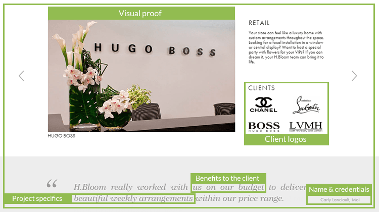
On the whole, users tend to trust real-life, interactive testimonials, rather than hand-picked and hard-coded ones. The quality of message, a customer’s photo, video duration, and customer credentials – all these factors in concert determine authenticity.
#20 Always be CRO-ing
Develop a Kaizen mindset for continual improvement. Designing a landing page is just a beginning. How to make it drive more traffic and convert without paying more for advertising? How do you decide what to tweak if your visitors don’t become leads or your leads don’t convert to customers? There may be all sorts of reasons. After all, your initial plan is little more than an educated guess.
That’s when continual testing comes on stage. To setup an ongoing testing program, you need to figure out strategic points, methods, and costs.
Know what to test… The baseline is:
- Consistency of ad and copy
- Layout
- Headlines
- Benefits Vs features
- Forms and CTA’s
- Trust signals
- Leaks
- Exit intent opt-ins
More advanced testing includes:
- Usability and speed tests;
- Friendliness (of all sorts, including mobile, browser, privacy, language, click, video, rating & review and more).
… And make sure it doesn’t cost you an arm and a leg.
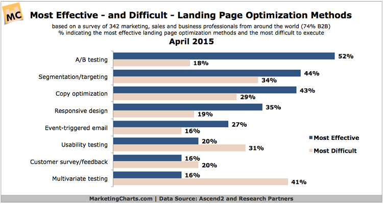
Landing Page Optimization Survey, 2015. Chart courtesy of MarketingCharts
Use the right tools to avoid guess-testing:
- Google Analytics (Experiments) – with this comprehensive free tool you can measure and learn simultaneously as well as test multiple versions of your page and learn what converts best.
- Usability Hub – a community of usability profis based on principles of mutual support. Sign in and choose the targeted demographics to run three types of tests – click tests, nav tests, and five-second tests – for free, provided you pay back in the same coin.
- Pingdom Website Speed Test – a free tool to measure your LP’s loading speed. But there’s more! It gives a comprehensive analysis of files, scripts, or images that may be holding it back.
- Landing Page Grader – ideal for PPC campaigns as it taps into your AdWords account (if you have AdWords conversion pixel installed). Provides tips on keywords, forms, competition and more.
- Last but not least, there’s a TestMySite tool from Google to test how mobile-friendly your landing page is. It also estimates your page’s mobile and desktop speed.
To conclude
Crafting a killer landing page is pretty easy if you follow these not-to-top secrets and take small steps to perfection.
Questions?
By the way, here’s a host of inspirational resources we collected while writing the post. Tap in!
Blogs & posts
The ABCs of Landing Pages That Work by CopyBlogger
The Periodic Table of Landing Page Elements (and How to Use Them for Explosive Success) by Leadpages
The Beginner’s Guide to Conversion Rate Optimization by Qualaroo
The Most Entertaining Guide to Landing Page Optimization You’ll Ever Read by Oli Gardner
Mobile Landing Page Checklist for Optimisers by Craig Sullivan
Hook, Line, and Sinker: 7 Tips for a Killer Call-to-Action by Billy McCaffrey
Podcasts
How to Craft Landing Pages that Work – Copyblogger Podcast
The Conversions Podcast – Learn Conversion Rate Optimization and Landing Page Optimization Strategies
Videos
Secrets To Setting Up Landing Pages To Convert Traffic To Profits (7 mins)
8 Landing Page Design Best Practices (5 mins)
Slide-decks
Social Proof Tips to Boost Landing Page Conversion
50 Landing Page Best Practices