A developer’s dilemma
Everyone’s on dating apps these days – it’s a common practice of finding a kindred soul or life partner. And yet… everyone agrees: dating apps suck. They’re phony, pricey, limited, boring, addictive, ineffective, unsafe. Although online dating has lost much of its stigma over the past 10 years, venture capitalists refuse to inject funds into the dating app creation.
Why’s the dilemma?
Perhaps, the root of the evil is not the app itself but the complexities and imperfection of the world? So much the better! All aboard in search of a winning formula for a perfect dating app!
Use the plan to jump to a question of your interest:
Tinder’s game-changing story
Matchmaking is as old as the world, but online dating has already been here for a while. 10 years ago, it was mainly deemed as the last resort – only desperate people seek love online.
It’s all changed now. A majority of people now agree it’s a good way to meet people. So what happened over these years to cause the U-turn in our habits and beliefs?
First, mobile phones grew ubiquitous. Next, there came the iconic swipe…
Of all the existing online dating platforms and mobile applications, only Tinder has made a breakthrough by engaging the people who were once skeptical of dating online. Thanks to Tinder’s enormous popularity, 70% of online daters now only use a mobile app.
Who doesn’t know Tinder
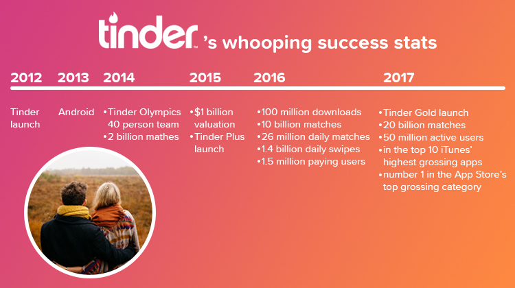
Tinder is a location-based dating app launched in October, 2012. In less than a year, it grew from being a plaything of a few hundred Los Angeles party kids to a multinational phenomenon. The app credits its popularity to the innovative swipe technique and elegant design. It’s already estimated to have 50 million users with 1.4 billion swipes per day.
Secrets of Tinder app success

While its competitors are still racking their brains over a secret formula of online romance, Tinder has concocted the entire love potion. Wonder what are the ingredients?
Simplicity & familiarity
The app combines the familiar format of other dating and hookup apps and rolls them up in one convenient hybrid app. The sleazy appeal of rating profiles, popularized by Hot-or-Not, and the excitement of apps like Grindr that let people browse photos of people nearby who are eager to meet up – make Tinder app intuitive and easy to use while waiting in line or partying with friends. Effortless setup via Facebook is equally inviting.
Ingenuous UX formula
Swipe, get matched, flirt and date. Of course! Mutual interest is a great starting point. No more crappy questionnaires thanks to the access to your Facebook profile. The app extracts and sorts the data – then you make your choices.
Swiping right and left is as engaging as playing a slot machine. Getting through tons of nice-looking faces is relaxing and soothing. Appearances may be deceitful, but that’s the way we’ve done it for ages. And most importantly, the app addresses the present day’s human anxieties, like the fear of rejection, and deters the creepy spammers with the double-opt-in feature.
Proximity feature – for spontaneous meetups
Fix a date whenever you’re in the mood. While other digital dating solutions are striving to out-compete each other with claims of compatibility algorithms and secret love formulas, the only promise Tinder makes is to show you the other users in your immediate vicinity.
Killer customer development strategy
Tinder’s effective customer development strategy – choosing LA college kids as early adopters and getting them to spread the word and act as role models – brought the much-needed audience early on. The cozy gamified experience transformed them into loyal customers. In fact, the following factors collectively contributed to the business stable growth:
- Ease of customer acquisition
- Efficient promotion campaign
- Creating a trend
- More socially acceptable that other ‘hookup’ apps
- Stickiness due to smart and timely product extensions and monetization programs
Algorithms that fuel stickiness
Tinder app may look and feel simple, but it’s only an illusion. Not if you look under the hood. You may be surprised to know there’s an algorithm of some sort as you don’t fill out any questionnaires. All you do is give access to your FB profile – and the app takes care of the rest. But that’s not so. Tinder claims, their algorithm took over two months to complete. Many product developers would give an arm and a leg to crack it. Here are some insights.
Tinder’s system rates users against multiple metrics. However, your ranking (i.e., how close your profile will be to the top and how often it will show in the search) rests mainly on these 3 factors:
- Desirability – how many right swipes you get (and not only that);
- Involvement – how actively you’re using the app, how often you check the updates (the more, the better);
- Choosiness – how picky you are (more ‘selective’ rank higher).
But that’s not it!
Tinder’s algorithm not only facilitates stickiness by incentivizing you to visit the app more often. It also prompts you to generate leads. Want more matches? Invite more friends. As simple as that!
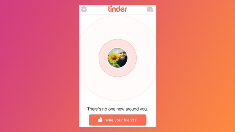
Anyone who has come across the ‘no one new around you’ message would agree how frustrating this can be.

But if people ARE looking for clues, doesn’t it prove the stickiness enough?
Tinder’s secret weapon – the Hook Model
Because of Tinder’s gamified format, the app is more often viewed as a gaming rather than dating app. Everything is permeated by the gaming spirit – from its animated design to ranking algorithms. And hence its addictiveness which is often compared to that of slot machines. How does this hook-up app manage to get its users hooked?
The trick is in creating addictive habits by stimulating a user with random rewards. The mechanics are as simple as that – user interaction with the product takes these 4 steps:
- Trigger
- Action
- Variable reward
- Investment
This is called the Hook Model. At its heart is variability of a reward: a powerful hack that captures attention, provides pleasure, and infatuates the mind.
4 reasons to create a dating app like Tinder here and now
- User behavior has gravitated towards online partner search, making dating apps part and parcel of this hunt.
- A dating app can be a goldmine as long as it’s a success – Tinder is now billions’ worth.
- YOU know the ingredients of Tinder’s success, which many others are still trying to figure out.
- The cost of mobile app development has never been more affordable.
Tinder’s business model canvas
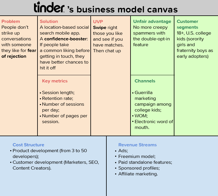
Although Tinder is constantly de-risking its business model canvas, its simplified version looks something like this.
Discover a real use case of an app for social meetups and short-term rentals. Our company designed and built the app, inspired by the Tinder Social and Airbnb business models.
Tinder’s monetization strategy
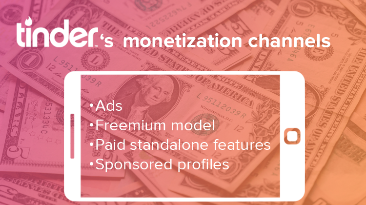
There’s always a hard choice whether to make your dating app free or paid from the start. That depends. Tinder went free and hit the spot. There are plenty of ways you can monetize a free app. And you can always switch to freemium as soon as you’re sure your app sticks. Let’s look at Tinder’s monetization strategy. There are 4 revenue streams:
- Ads
- Subscription (Freemium model)
- Paid standalone features
- Sponsored profiles
Ads
Tinder launched in 2012 as a free app and monetized through ad campaigns. Free apps tend to irritate users with all sorts of advertising – interstitial, native, incentivized, display ads and banners.
Later, Tinder’s subscription model granted paid users an option to switch off the annoying ads, except those displayed in the format of users’ profiles.
Subscription (Freemium model)
Tinder became Freemium with the introduction of Tinder Plus in 2015. Later on, they extended the app by Tinder Gold. The Freemium model is actually a monthly subscription that gives access to premium features.
Tinder Plus (premium features) is a subscription plan allowing users to access the following:
- unlimited swipes
- passport (find match at any location)
- more than 1 super like per day
- rewind feature (undo the last swipe)
- 1 boost every month
- turn off ads
The cost of Tinder plus varies between $9.99 to $19.99 in the United States depending on the age of the user (over 28-year-olds are charged 4 times as much).
Tinder Gold (extension of Tinder Plus) adds a new Likes You feature. It lets you see how many likes you have and a grid of the people who liked you. You can like back, dismiss, or check the person’s profile without wasting time in swiping. Its price ranges across countries from $14.99 to $82.99. You can switch from Tinder Plus for $5.
Paid standalone feature (Boost)
In Tinder, users can also handpick certain features they want to pay for. Presently the only such feature is Boost.
Apart from being included in the freemium model, Boost can be purchased as a standalone feature for $1.99 to $3.99 per boost. It sends a user’s profile to the top in the area for 30 minutes. This increases the chances for a match – 10 times more profile views and 3 times more matches while boosting.
There are vast options for other standalone paid features within Tinder app like ‘limit number of searches per day’, ‘pay for private chat’, ‘pay for profile highlighter’, ‘pay for direct message without a match’, etc. However, you need to weigh them carefully and not let your subscription revenue slip from under your nose.
Sponsored profiles
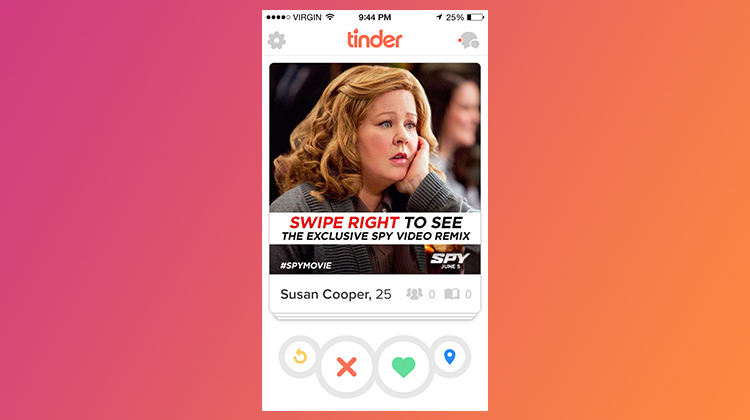
There are partnership programs allowing corporate bodies post sponsored content/native ads using Tinder’s familiar format so that they look less intruding.
What’s under the hood
All this tech speak can be pretty nerve-racking. Unless, of course, it thrills you to know what’s under the hood. In that case, we’ve collected the data for you.
So if the names ‘feature set’ and ‘technology stack’ sound like music, keep on reading. Want to know a rough estimate of a dating app MVP? Or how to make it better than Tinder?
Here goes…
Tinder’s technology stack
Of course, Tinder’s is not the only possible tech solution for building a dating app. Nor has their strategy always been a straight road. But here’s Tinder’s technology stack:
- iOS
- Objective-C, Swift
- Android
- Java, Kotlin
- Backend / API
- Scala, SQS, Kinesis, Kafka, Spark, Kubernetes, Rundeck and EMR, Node.js
- Database
- Mongo, Dynamo, Redis
- Marketing
- Amazon SES, Mailgun, SendGrid
- Product & Design
- Adobe Typekit, Blossom, Google Fonts, Sketch
- Analytics
- Google Analytics
- HR
- Greenhouse
- Productivity & Accounting
- G Suite, Siftery
- Login proper
- Facebook data extraction
- User profile creation
- Age
- Distance
- Mutual friends
- Mutual interests
- Tagline / brief description
- Invite friends
- Swipe and match with groups nearby
- Group messaging
Tinder’s basic feature-set
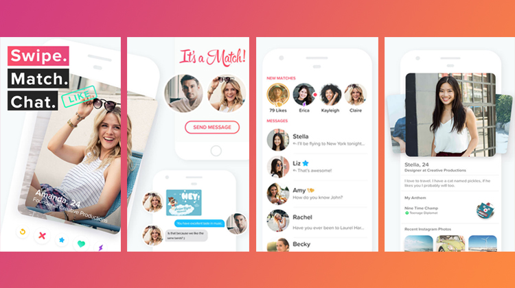
Here’s what Tinder users now have – for free.
Facebook login
The signing-in is pretty simple – login via Facebook. Next, Tinder algorithm extracts FB data to create a basic user profile. Facebook data extraction is nice to have as it lightens the process of profile creation so you may skip tedious form-filling or adding profile pictures. The feature is 3-in-1:
User profile
So, on Tinder, user profile is generated via Facebook. All the basic information like profile pictures, work, college, interests and other is imported from Facebook. Next, a user can update the profile to his/her liking by adding a brief description or ‘tag’ of oneself. Besides your photo, users will see:
Geolocation
Proximity is central to Tinder model. It suggests contacts based on a user’s location. Geolocation feature is among the app’s critical functionality as the app needs to ensure constant fetching of a user’s current location and the profiles of their preference by a device used.
Discovery settings
Along with automated profile creation that allows for a default search, a user may adjust the search by setting the age, sex, and distance filters. In the free version, a user can set geographic perimeters to no more than 10 miles away.
Swipe
Create a swipeable card interface. Swipe, so innovatively used, has been Tinder’s UVP. The app is designed to employ swipe for sorting through candidates. The initial list of prospective matches is based on geographical location, the number of mutual friends, and common interests. You then swipe right for ‘like ’ or left for ‘nope ’.
Match
That’s the server side of the app development. A match is a prerequisite to start a chat. That’s only possible in case of mutual interest, that is if both users swipe right.
Chat
On Tinder, as soon as you have a match, a private chat option opens to you. The basic chat feature will enable users to type, send, and view messages. On Tinder, users can also ‘like’ a message by tapping a green heart or add emojis and GIFs with the blue GIF button at the bottom of the chat interface. iPhone 3D touch allows you to preview links sent within messages.
Push notifications
Push notifications are familiar, engaging, an absolute must to ensure frequent returns to the app. They notify a user of a new match, a message or a moment like is received.
Tinder’s advanced (paid) features
These features made it possible for Tinder to transition from a free pricing model to a freemium upsell. Although not critical for the app’s operation, they enhanced its performance and ensured better user retention.
Hide adverts
Ad-free experience is a huge benefit of paid users.
Boost
This is a queue-jumping feature allowing to compromise ranking algorithms and come on top of user list (that is for a moment to become the most ‘desirable’ candidate – all’s possible for the one who pays. A server-based feature.
Super like
Swipe up to Super-like someone. Matches who you have Super-liked will have a blue star next to their name in the list. With this feature, you notify a user of your interest instead of anonymously liking them in the hope of mutual interest. They will see a blue banner underneath your name. That increases your chances of a match threefold. Tinder Gold grants 5 Super likes per day. The same feature is limited to 1 Super like per day in Tinder’s free version.
Likes you
You can see who likes you before you swipe. Besides, you see all your likes on the screen as a gallery and know if they like you back.
Rewind button (undo dislikes)
The button cancels the previous dislikes and gives the candidates a second chance. In the app’s free version a user can’t ‘look back&rsquo, and reconsider the last match.
Location change (Passport)
Each time a user logs in, GPS-based matching creates a list of new user profiles to swipe through. In Tinder Plus, a user may alter location at will while actually staying at a different location themselves – this is Passport.
Unlimited right swipes
What you actually do is declare a maximum number of swipes per day in the free version of the app and disable this feature in the paid one.
Smart photos
The feature uses an ML algorithm to automatically adjust the order of a user’s photos depending on who’s swiping on the other end. So what one person sees as a default picture may be different for another based on their typical swiping patterns analyzed by the algorithm. It’s designed to “maximize the potential” of the first profile image and appeal to a wider audience. Tinder says this profile alternation led to a 12% increase in matches during testing.
Moments
This Snapchat-like feature didn’t work well for Tinder and was ‘swiped left’ on after a year. It allowed to create and share photos (moments) using various image filters, with text, and scribble on them in various colors. A clicked moment remained active for 24 hours. The purpose of Moments was, according to Tinder co-founder Sean Rad, to jumpstart conversations among matches. If a match liked your Moment, they could swipe right. The app would notify you of their interest, and then you could both start chatting.
High-profile dating (Tinder Select)
Tinder Select is an invite-only service for elite and celebrity Tinder members. Perhaps, exclusivity is also the reason why not much is known about the functionality. It’s a tier of the regular Tinder app and users of Tinder Select can toggle back and forth between both services. Tinder hasn’t announced Tinder Select and wasn’t interested in speaking to Tech Crunch about it. But one thing is for certain: elite dating apps are on the rise.
Swipes between groups of people (Tinder Social)
The feature allows you to switch to the ‘Social’ mode and back and either swipe on individuals or together with your friends swipe on other groups. Other features in Tinder Social include:
How to build a Tinder MVP
So you want to enter a dating app market. Where to start? Go small. Build an MVP. How? Tinder’s MVP is great. Then go ahead and start tweaking.

Want to have a better dating app? – Build an anti-Tinder
How so?
Well, here’s the truth: Tinder app IS a success and it DOES work. But does it work properly?
Despite the app’s popularity, the character of user activity doesn’t indicate much of dating intention. In fact, an academic research has revealed, 70% of the app users have never even thought of going out on a date.

Well, it’s certainly a matter of personal preference and, after all, Tinder’s UVP – to boost confidence – works fine… in a way. Just check the app’s user motivation graph below.
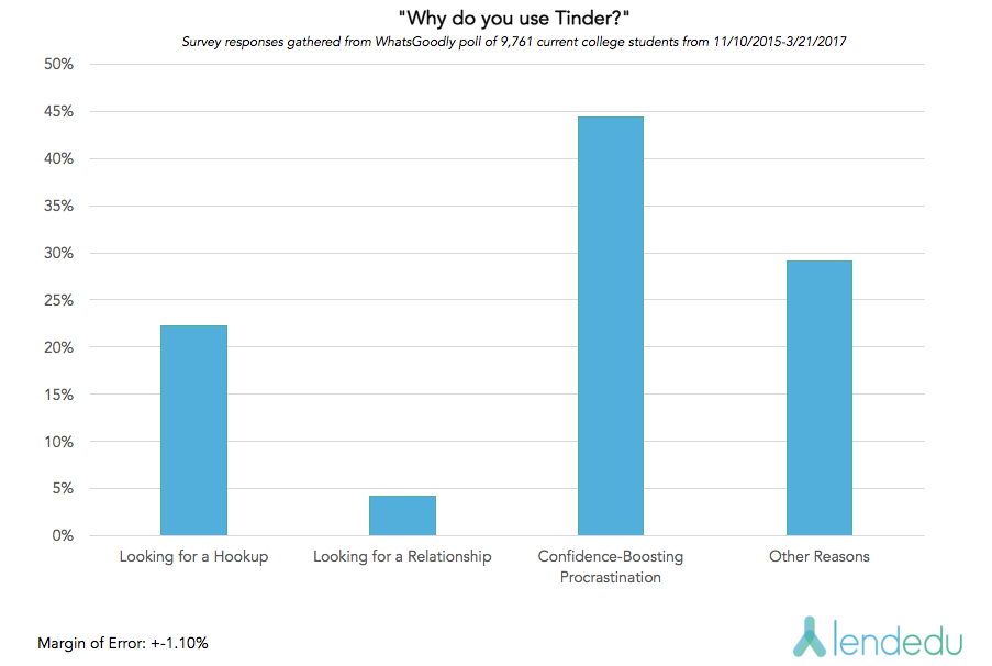
Image source Lendedu.
Still… There are ways to make a better app.
And here’s how.
Tweak the concept
See how even this well-meaning intention – to boost confidence – may end up in procrastination and addiction to the swiping process. Does Tinder help overcome your natural shyness and actually start acting?
While swipes are great for the company, they alone don’t solve the problem of loneliness. Nor does too much choice make us happy. How to focus more on quality? Sometimes less is more. For example, CoffeMeetsBagel limits a daily card deck to 21, of which a user can choose. That way you don’t overwhelm or paralyze your users.
Enhance the UI design
Ok, wait! Tinder’s UI is great with large quality pictures and the new ‘smart photos’ feature. What else is there to tweak?
The card format places the photo front and center and leaves too little space for an elevator pitch. Why not give the bio a bit more weight?
Personalize UX
The way we judge people by their looks is unique and often unpredictable. There are often these subtle tell-tale signs that trigger our choice – almost subconsciously. The same holds true for bios. Where humans can’t explain the chemistry of online romance, AI can help. Robots collect and analyze the data of our choices – visuals, text, facial expressions, user feedback – and offer insights.
In fact, Tinder’s recent new feature ‘Smart Photos’ is an attempt to enhance a user’s matching chances via machine learning. The app analyses the ‘likes’ and ‘nopes’ of a user’s photos and may reorder the pics for various viewers based on their preferences.
Some tech enthusiasts are already automating Tinder app with AI for another reason – to spare our most precious terminable resource (hint: the clock ticking).
Tweak the algorithms
Despite the claims of Tinder app’s men bias, researchers have, in fact, revealed the opposite: Tinder’s ranking algorithm tends to be repressive towards men. The app rewards selectivity – which women are prone to – with the higher ranking and, consequently, more matches. It causes kind of ‘feedback loop’: men, punished by fewer matches, become even less discerning, while women, rewarded with more matches, can get even more selective.
Moreover, the way Jonathan Badeen – Tinder’s VP of product – hints how ranking algorithm works, it’s very much like the ‘Nosedive’ scenario from the ‘Black Mirror’ series. The logic is, ‘whenever you play somebody with a really high score, you end up gaining more points than if you played someone with a lower score’. Creepy!
Find your audience
Don’t try to be everything for everyone. Tastes differ and there’s a fat chance you may succeed with a niche app. Niche dating may be another fad. But we never know when love strikes – when you share your passion for food (Sizzl, SaladMatch, VeganSingles), music (Tastebuds), or a pastime (FarmersOnly, Twindog).
Exclusivity kindles human desire. The League app plays with the idea of raising the benchmark. Only ‘high achieving individuals with good education and career prospects’ get a chance. Some people will kill to get in. Oh, yeah… and you can pay to skip the waitlisting hassle. Great monetization idea!
Provide user safety
The only user verification on Tinder is via a Facebook profile, which means creating a false identity isn’t a problem. Admin control is essential for user retention. Spammers, fake accounts, uncensored content, catfish relationships can mar your app’s reputation more than anything else. Consider an admin function or offer incentives to users for moderation.
Now, the idea of dating a complete stranger sounds sort of… spooky. Hinge, for one, builds relationships around the concept of mutual friends – your network steps in as a guarantor of safety as well as an icebreaker on a first date.
Use common sense
Want to create a dating app that helps users fall in love with each other – not with your app? Build an anti-Tinder.
But leave the Swipe…
How much does it cost to build an app like Tinder with CodeTiburon? Want a detailed estimate?

Thanks for the article! Was really informative and interesting read, as it covers all the basics of dating app creating process. Dating apps are on really high demand nowadays, as the market is new and really perspective.
Thanks, Peter. Indeed!
Hey this is a great article! I am looking to develop an app based on tinder format and this is nice information to have 🙂 great analysis
Thanks for the kind word, Maurizio! Glad that we could help 🙂
Amazing write-up, the blog you shared on building dating apps is very informative. Thank you for sharing your great thoughts on this blog.