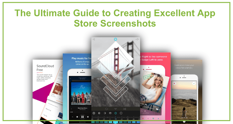
The Ultimate Guide to Creating Excellent App Store Screenshots
So you have created an app, and, let’s say, it is perfect. It has been designed and developed by geniuses, and you are dead sure it will do well on an app store. But here’s a catch. Just posting your precious app’s ad won’t be enough for it to actually become a hit. Every good product deserves great marketing. You might be wondering: What is the first step when marketing a mobile app? The answer is KILLER SCREENSHOTS.
So you have created an app, and, let’s say, it is perfect. It has been designed and developed by geniuses, and you are dead sure it will do well on an app store. But here’s a catch. Just posting your precious app’s ad won’t be enough for it to actually become a hit.
Every good product deserves great marketing.
You might be wondering:
What is the first step when marketing a mobile app?
The answer is… KILLER SCREENSHOTS.
In this post, you’ll learn:
Why screenshots matter
When a user comes to your app’s page, s/he will see three main components: the app’s icon, a screenshot, and a description. Naturally, a screenshot is the first thing that catches a user’s attention. It takes up much more space on the page than other components and has a direct effect on the user’s impression of the app.
How to meet technical requirements
When creating app store screenshots, first consider the technical requirements! Without knowing your limitations, there’s no way you can make screenshots that will look professional and drive users’ attention.
App store requirements
Screenshot sizes. For quite some time, mobile app developers had to upload screenshots of different size that would match all generations of iPhone.
But, not too long ago everything changed! Last year Apple announced its Simplified Screenshot Submission Process. Now, you can upload just 5.5 screenshot asset, that matches the screen size of iPhone 7 Plus. Apple platform will adjust your screenshots to all screen sizes automatically.
File format. For the file format, you can go PNG or JPEG.
Image number. As for the number of screenshots that you can upload on the App store, you can do from 1 to 5 images.
Google Play regulations
Screenshot sizes. Unlike App Store, Google Play store screenshot sizes should match minimum and maximum dimensions.
- Minimum dimension: 320 px
- Maximum dimension: 3840 px
Note: if your app is intended for several devices like Tablet, Android Wear, etc, you must upload screenshots for each particular device.
File format. For the file format, you can go JPEG or 24-bit PNG. Although we personally prefer the latter.
Image number. As for the number of screenshots that you can upload on Google Play, you can do from 2 to 8 images.
Screenshots styles. Picking the right flavor
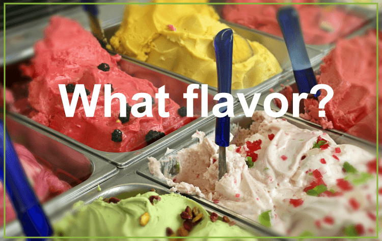
Imagine coming into an ice cream parlor. Your eyes are gliding over all the variety. The shop assistant asks you:
What flavor?
That rings the bell. Like in that IQ film you saw as a child, ‘Good question. Simple. Specific. And it’s got an answer.’
Now it is your turn to pick a flavor of your screenshot, read carefully and make your choice.
Here are eight of the tastiest flavors for app’s screenshots.
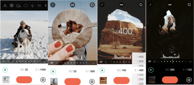
#1 Classic is always in style
Classic screenshots are still used by Apple in every single app they advertise. The number one concern about this style is that it might not be the best way to market a new commerce app. For some people, it might appear boring and not original.
But, if you still decided to go classic, Manual – RAW custom exposure camera and TouchRetouch are the apps pulling off this style.
#2 Solid color and device
Today every other app on the app store uses this style. The concept is pretty simple, you choose a stand out color and place a device with the screenshots of your app on it. Usually, it comes with some descriptions above or under the device. The style highlights the colors of your app and strengthens the descriptions. Here are some successful examples.
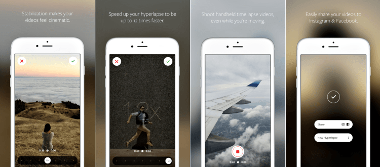
#3 Blurred Background and Device
Well, this style is pretty much what it sounds like. You take a blurred photo put it as the background, and on top of that, you place a device with a screenshot. This type of screenshots has become pretty commonplace with cooking and photo editing apps. It brings a more in-depth appeal to a screenshot and makes it more stylish.
The best example is Hyperlapse.
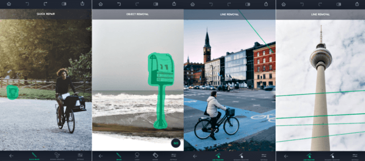
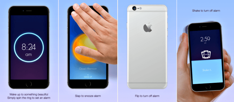
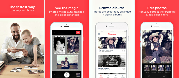
#4 Tutorials
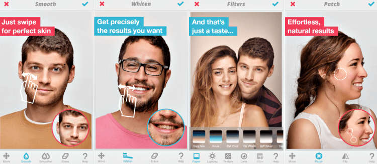
By using this style of screenshots, you give your user a simple yet necessary tutorial. Chose this style if your app requires a user to interact with their phone in a new and unusual way. Remember, this is a tutorial, make sure your instructions are clear and short. Wake and Facetune are two very good examples of how you can use this style to your benefit.
#5 Connected
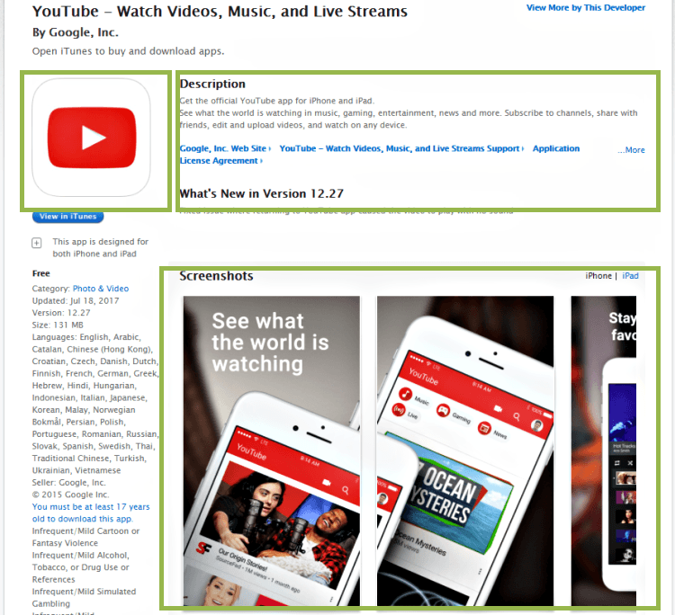
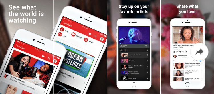
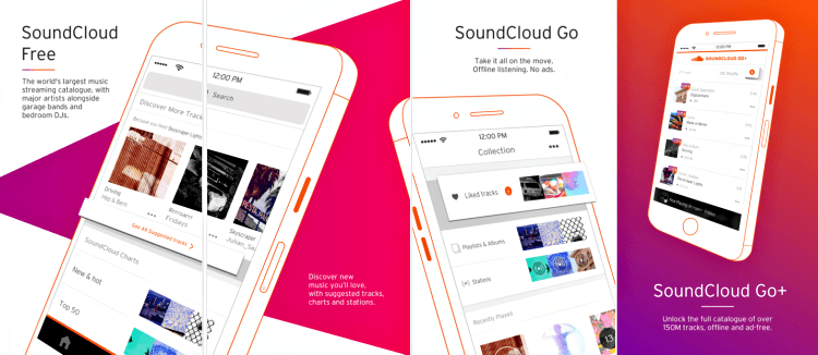
‘Connected’ screenshots were a hit a few years ago. But today designers choose to avoid this style because it is hard to get it right. If you mess up, your screenshots will look confusing and difficult to read. Now, do not get disappointed just yet, there are a few apps, that are still rocking the connected style: YouTube – Watch Videos, Music, and Live Streams and SoundCloud – Music & Audio.
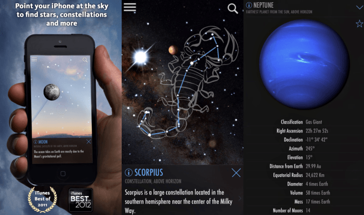
#6 The Splash Screen
The splash is basically an ad that is not part of an app but shows its functions and explains what the app is for. The first screenshot delivers your app’s message. It is a really good marketing decision that makes an app stand out from the crowd. Here’s an example of how to use the splash screen the right way:
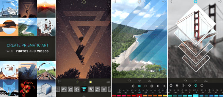
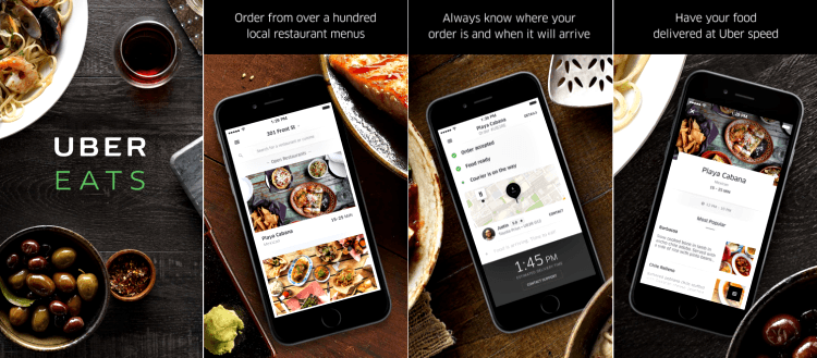
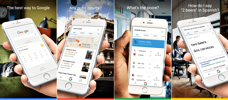
#7 Photography
Photography helps users to see an app in a real-life environment. This way you show your user what you are offering. But do it wisely – don’t let photos overshadow the actual app. UberEATS: Food Delivery, Fast and Google – the official Search app show how to implement photography elements into your screenshots without stealing the spotlight from the app.
#8 Combinations
Best practices of app screenshot creation
Tell a story
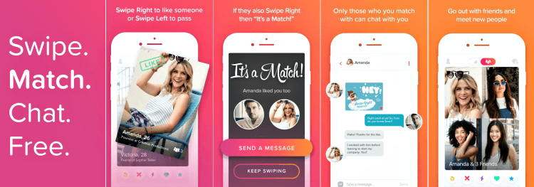
Screenshots can’t be just screenshots! If they don’t provide valuable meaning, users won’t download your app. Tell a story, appeal to all kinds of emotions. Users will scroll to the end of your screenshots if they have a logical sequence. All your images have to be linked together. The first one should explain the app’s core feature, the next one should continue the previous one while presenting most important functions of the app.
A perfect example of storytelling is Tinder. The way the first screenshot shows the core features and others explain step by step how the app works would not have been so captivating without a love story – a perfect way to ignite your users’ hearts.
Add text
Using additional text right on top of the screenshot has become really popular, it helps users understand what the app is about and how to use it. But, it has to be properly implemented.
Note:
- Ensure the text readability.
- Two lines are enough.
- Emphasize app’s features with verbs.
- Maintain the app’s design style.
Enlight is an excellent example of how to implement text into screenshots.
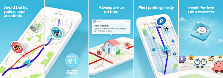
Prioritize benefits over features
Concentrate more on the benefits the user might get rather than the actual features. Do not let your screenshots be just a list of features. Make it more appealing to users, show how your app can solve their problems and improve their lives. Follow the example of Waze Navigation & Live Traffic, that explains how it can make the users’ lives easier.
Include media mentions and awards
If your app is that awesome award-winner, don’t be shy. Say it out loud! By adding the award’s icons to your screenshot, you can justify your app’s credibility and influence a user’s decision to download the app.
Note:
- Use the screenshot space wisely, do not clutter its elements.
- Use only true awards and comments.
SkyView Free includes its awards in the screenshot, so it looks appropriate and convenient.
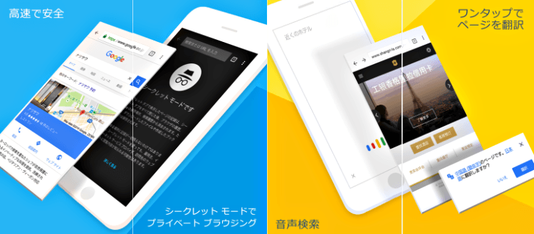
Adjust the language
In case your app is developed for a different location with different languages, you should provide users with screenshots in the language that they understand. What’s the point describing the app’s features if your audience can’t read it? Try to not only translate the additional text but also the entire app’s interface. Chrome – web browser by Google does an excellent job of adjusting languages. Here’s the Japanese version of the app and its screenshots.
Best tools for creating an app store screenshot
Now, when you know all the tricks and possible styles, you finally have chosen the style for your screenshots the next step is to actually make them.
‘But how will I do that?’ you’ll ask.
The following programs and websites will help both beginners and experts.
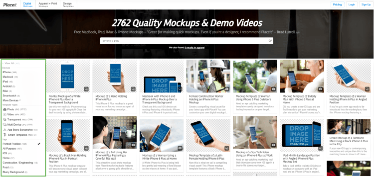
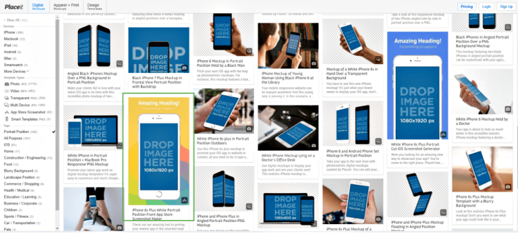
Placeit
Placeit is a website that uses a drag-and-drop interface to create app store screenshots. You can just pick your screenshot and place it on the device. If you decided to show your app in the real-life situation, Placeit is definitely what you need.
It has a big catalog of almost every scenario and devices that are possible, like seeing a device on a table or in a hand.
It even allows you to create animated images that could be great for showing users how to work with the app. The price range is quite amazing. You can choose a free version or subscribe for $12 to $250+ a month. The free version comes with a watermark. The price depends on how much work you want to put into your screenshot. So, the price covers every budget.
Note:
If you need options like native support for overlays, text or correct sizing for app stores, Placeit is not for you!
Screenshot Maker Pro
Screenshot Maker Pro is a free iOS app that places screenshots into pictures of different devices. The free version allows you to save two screenshots per day, if you decide to upgrade to the unlimited saving option, it will cost you $2.99.
The app is user-friendly and gives you the opportunity to place screenshots not only on the iOS devices but also on Android, Windows, Blackberry and even Mac OSX.
All you need to do is choose your screenshot, the device, and features like reflection shadow, etc.
Note:
The app doesn’t have features like adding overlays or text onto your screenshots. Created screenshots are not sized for certain app stores. For this, you need to use additional tools.
Promotee
Promotee is an OSX app that uses a drag-and-drop interface to let you place images into different devices. It is very similar to Unlike Screenshot Maker Pro, but it doesn’t have Windows and Blackberry devices in its catalog.
All you need to do is drag an image to a specific device and click ‘save’. Just like the Screenshot Maker Pro, the app can’t size screenshot for any particular app store.
Use Promotee if you need a quick and an easy-to-use tool.
Do not use Promotee if you’re looking for a tool with rich customization options.
Adobe Photoshop
Adobe Photoshop is a great tool that can give you pretty much all the features you can possibly need in order to create an amazing screenshot. It even has a free trial for you to check out.
Yes, this tool is for those who know how to use it. But do not get disappointed, today there are hundreds of tutorials that can help you master this tool.
Step-by-step guide to creating an app screenshot
Good job! You’ve nearly accomplished our ultimate guide to screenshot creation. As a bonus, enjoy this easy-to-follow tutorial. We have chosen one of the described above tools, Placeit, to give you a hands-on experience.
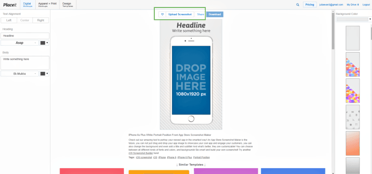
Step 1. Go to Placeit. In the left-hand column, choose a device and other properties for a screenshot, like position and scenario.
Step 2. Choose a template that you like.
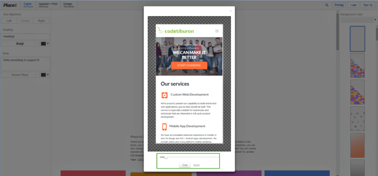
Step 3. Upload your screenshot or drag it onto the device.
Step 4. If your screenshot doesn’t match the chosen screen, crop it.
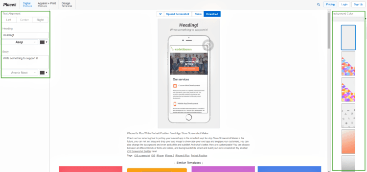
Step 5. Now, you can Pick a background color, a background ornament, a text font and color.
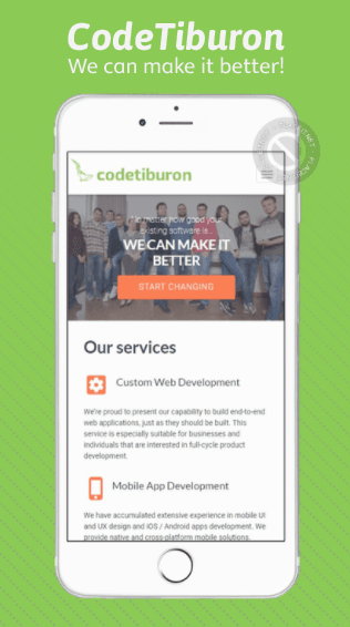
Step 6. Voila! Enjoy the result.
Have you enjoyed the post? Remember to tell a friend.