When you hear ‘a landing page’ for the first time, your mind runs wild in search of clues: What? Who? Why? When? How? A LANDING PAGE?!
Relax! We’ll sate your curiosity. In case you don’t know yet, just keep on reading.
A landing page explained: TL; DR
A landing page is a special website page designed with conversion in mind. A visitor gets on the page from an external paid or organic link in search results. By clicking a call-to-action button, a visitor ‘converts’ into a lead or customer – that’s the desired user behavior and key purpose of a landing page.
What is a landing page
Let me put it in plain language… Harry Potter. Travelling portals. But no Floo Powder. Just a click on the ad – and BAM! – you land on a page. MAGIC! Webmasters are a fiction-minded lot – hence the name.
A landing page is basically any page that you arrive at – or ‘land’ on – when you click on a result (both paid or organic) in a search engine. However, marketers are more precise about this sort of pages: not all web pages are landing pages, they say, but only those that stand apart from the rest of the site and serve a distinct purpose – attracting and retaining the right audience.
Who ‘lands’ on a landing page
Who are those ‘right people’? What do they do once they ‘land’ there? Depends on the reason your landing page exists. As a rule, a landing page is designed to prompt a desired user behavior – marketing folk call it ‘conversion’.
So the people arriving at your landing page potentially become your ‘converts’. And you channel all your efforts, or at least magical powers, to make them ones – that is, you hide the navigation, craft a compelling presentation of a unique value proposition and hex the button.
OK, how do the people ‘convert’? Basically, in two ways – by giving away money or personal information.
Why do I need one on my site?
Consider the statistics:
- 64% of marketers claim a landing page is the best way to test a value proposition;
- over two thirds of B2B companies use landing pages to attract new sales lead for future conversions;
- 48% of marketers build a new landing page for every marketing campaign.
Ah… That’s the reason why you have a site in the first place – either to sell or say something. Whether you are promoting your business or communicating your interests to the world, you need your audience. Digital presence is a powerful tool. You can stay in touch with your audience and get ideas across. In the days of attention deficit, a landing page gives you a lifetime chance to get through information noise and channel your visitors’ full attention toward your product or service.
From an SEO perspective, the purpose of a landing page matches one of the three query types: transactional, informational, or navigational. Now what exactly are people looking for here?
- Transactional, aka commercial query, aims at buying a product or making some financial transaction.
- Informational, or noncommercial, is when a searcher is looking for a certain piece of information or knowledge about a subject or concept.
- In navigational queries, a person is simply trying to navigate to a particular site or page, ignoring other search results.
The overwhelming majority of all queries are informational (80%), leaving the rest 20% half transactional and half navigational. Knowing that, you may jump to a hasty conclusion that low conversion on ecommerce sites derives from insufficient transactional queries. But it’s the other way around. Accessibility of information has changed consumer behavior toward more informed decisions. Thus informational and navigational queries bear greater potential of conversion today. In order to sell, you need to build customer awareness of your product first. Conversion rate relies greatly on how informative, relevant and trustworthy your message is.
Whatever are your conversion goals, creating engaging content, visual appeal and overall positive user experience is an absolute necessity. Since your visitors have a different amount of interest or knowledge about your product, ‘user engagement’ with your site comes in all shapes and sizes. How to capture their interest? Or make them love your brand? That’s the major challenge and the reason you will need to design various landing pages. Ideally, several landing pages on a website is a norm. Each serves just one specific purpose, targets one specific type of traffic. And every single one can be tracked and adjusted separately for proper performance.
From the marketing viewpoint, two basic types of landing pages serve two primary marketing objectives: lead generation (lead-gen pages) and lead capture (click-through pages).
Lead capture landing pages
This sort is typical of, but not limited to, ecommerce sites. It presents a product description. As the term suggests, a click-through page encourages a visitor to click through to another page – e.g., a shopping cart. Both pages form an ecommerce funnel. The first one ‘warming up’ a visitor to the state of making a purchase decision. The second – accomplishing a purchase and actually converting a visitor into a customer. Stats have it, only a little over 2% of well-informed customers are ready to make an online purchase right away. A 5% conversion is considered more than successful and only top 10% of landing pages across industries achieve 11,45% conversion rate.
Lead generation landing pages
A lead-generation (lead-gen) page collects contact information for a mailing-list. You may offer one of these in exchange:
- Whitepaper or e-book
- Webinar registration
- Consultation for professional services
- Discount coupon/voucher
- Contest entry
- A physical gift (via direct mail)
- Demo (free trial) of a product
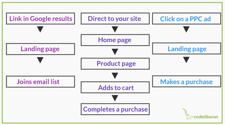
As it turns out, your potential customer’s journey make lie along different paths depending on why your landing page exists:
What are the essential elements of a landing page
The first question a visitor to a web site asks herself is ‘Why am I here?’ Sometimes it’s hard to answer – so they leave. The 3 main reasons for visitors leaving a web page are:
- Failing to find what they search for;
- Not knowing what to do next;
- Not finding the site credible.
To prevent bouncing-off, it is vital to have the right elements properly arranged. Landing pages direct a visitor’s attention solely towards a particular offer and so all the elements in accord should fulfil this attention-grabbing function. Given that a short attention span is the main hurdle to getting your message across effectively, you have less than 8 seconds to produce a positive first impression.
So what are the indispensable elements any landing page should have?

Get on board! Here’s the anatomy of a perfect landing page:
- a headline
- a logo
- a subheadline
- a description
- visuals
- a call-to-action button
- trust elements
- incentives
- a form
- share links
- a thank-you page
Ans here’s how high converting landing pages use these elements.
Headline
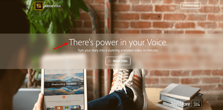
It’s the first attention-grabbing element that clearly and concisely informs a visitor of your offer. Creating a killer headline is vital for visitor retention. Remember, a landing page headline should clearly communicate the same idea you postulate in your ad campaign that sent the visitor to your site. If they should see any mismatch, nothing can keep them from bouncing off it ASAP.
Logo
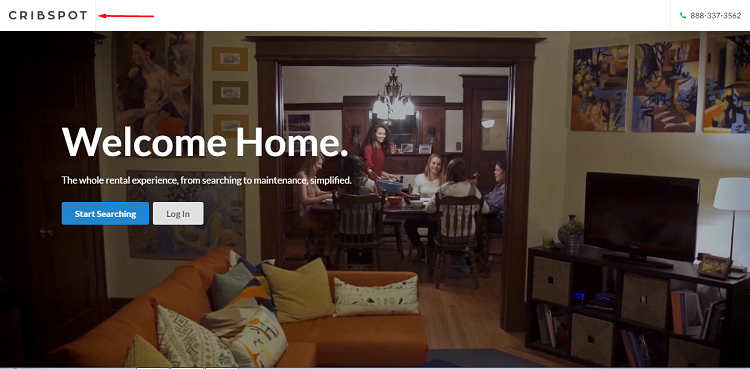
Your landing page may serve a different purpose compared to the rest of your site. But brand identity elements, such as the logo, a common color pallette, style and corporate typefaces bind it all together.
Subheadline
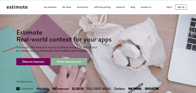
A subheadline is placed directly under the headline. It contains a short explanation that leads into the main description. Though visually less significant, it has to be more persuasive than the headline. The way you verbalize your offer will prompt a visitor to stay or leave. Have you addressed your audience’s pain points? Including one in a headline or subheadline increases conversion rate by 31%.
Description
A longer description reinforces your unique value proposition. Write a bullet-point copy of key features and then briefly summarize the benefits of your offer. Sometimes, if your description does not go below the fold, only an easy-to-scan list is enough.
Make sure you avoid clutter and informational overload. Put only the ‘need-to-know’ information and leave out ‘nice-to-knows’, however interesting these may seem. Sometimes infographics joining textual explanation do a better job of demonstrating a product’s properties or benefits.
Visuals
A great visual should be about what you are selling or giving away. Images are an excellent way to increase conversion as long as you have the right ones. Images of people seem to attract everyone’s attention, provided they are high quality and not just stock photos, which may completely destroy trust and turn off your visitors. But here’s a catch: people tend to look in the same direction as a person on a photo – so make sure they look at either your key message or your CTA button and not your keyboard.

Rich media, such as demo videos, gif images or slideshare presentation of your product, work even better. It has been proven that videos on a landing page yield a 64-85% higher conversion. Small wonder, given that a video format is pretty habitual for information consumption and it provides extra time for your brand message to sink in.
CTA button
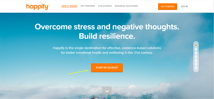
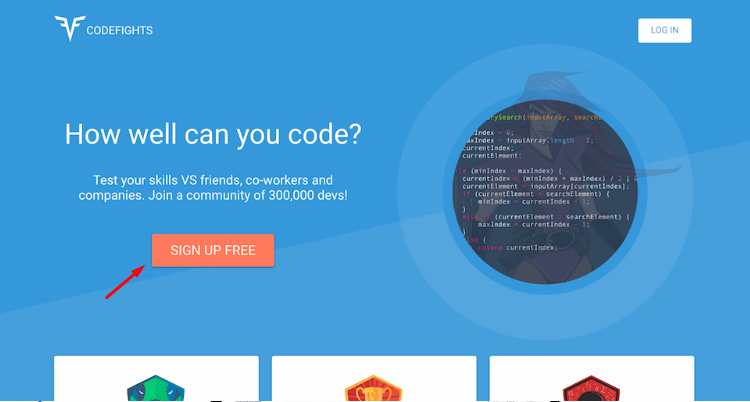
A CTA button is the focal point of your landing page design – mind you, this should definitely be a button, not just a link. Must be the most vivid element on the page – so a contrasting color (red or orange), the right size (clickable from a mobile screen) and a proper place (above the fold) are crucial. Sometimes two buttons are placed on a page, especially if you prompt your visitors to scroll. However, ‘the more the better’ principle does not apply here and two visible ones at a time are more than enough even with longer pages.
A CTA button concludes the form-filling or opens a payment gate – the last step for conversion to take place. All the other elements on the site ‘conspire’ for that to happen.
Trust elements
Credibility of a site does not result from presence of certain elements on a page. The ways trust builds are intricate and unpredictable. Often subtle nuances can make or mar the general impression.
As a rule, the following items facilitate transparency and create a positive emotional bond:
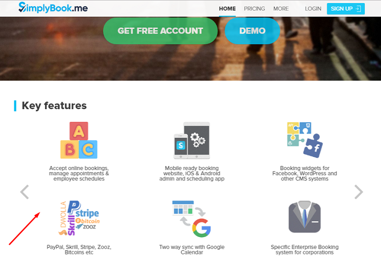
- Testimonials, reviews, and certifications. Logos of well-known brands working with you, which are using your product, are a definite guarantee for the product itself. They show not only your website’s credibility, but your business’ as well. Social proof elements, like reviews and testimonials, produce a surefire psychological effect known as ‘I’ll have what she’s having’.
- Your email and phone number show you’re real and approachable.
- Privacy statement may also increase conversion since many potential customers are concerned about how their private information will be used. At the very least, it gives more transparency and makes your site more SEO-friendly.
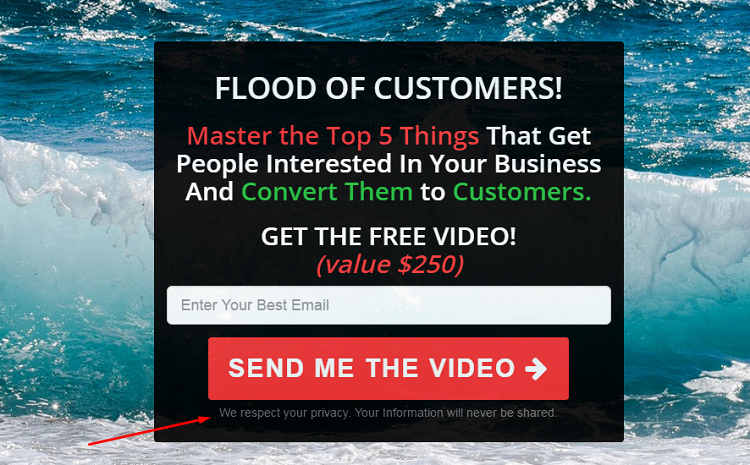
- An empathy message, like the one ‘We hate spam as much as you do’, spares your visitors time reading a privacy policy. This message, placed near the CTA button, gives extra reassurance that a visitor’s private data won’t be used for spamming or in any scam dealings.
Incentives
Incentives are bonuses like free trial, coupons or discounts. We all love bonuses. Coupons and discounts are a common practice of product marketing campaigns. If your ad has one, make sure to include the code on your landing page as well. Adding one to a navigational frame so that it stays with the user throughout the visit will help to close the deal more smoothly.
Form
Now you’re no longer surprised what you need a form for? Right you are! To capture information about your visitors so you may convert them into your customers right away or reach out to them in due course. A visitor may be asked to fill out a form for an ebook, fill out their email address to subscribe to your blog, or fill out transactional information to purchase a product on your site.
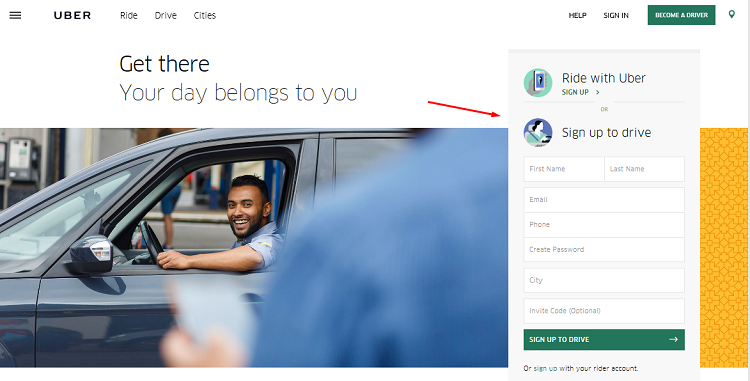
A good form is short and provides:
- easy-to-follow steps
- progression indication
- access to the necessary information on the landing page (so you don’t need to abandon the form in search of it)
- options to contact information for more questions (phone number alongside ‘chat’ and ‘contact-us’ links)
Share links
These are the elements to spread word of your brand. Electronic word-of-mouth is a powerful marketing tool so make sure you add the buttons in the footer or sidebar.
Thank-you page
Although a thank-you page is different from a landing page, it’s a vital element once conversion takes place. Your visitor fills out the form, clicks ‘submit’ and – hey presto! – turns into a customer. Mission accomplished! Right?
Wrong!
Why should you be grateful to your newly converted audience? Well, it’s just plain simple – they have trusted you enough to give their credit card number, email address, or phone number. Isn’t it a beginning of a happy long-term relationship with your customer?
Because conversion is a more costly and complicated procedure than customer engagement, many companies get it all wrong with thank-you pages and bid their converts goodbye right away. While this is a perfect moment to start customer engagement. Besides, a thank-you page is a great place to test:
- loyalty programs (here’s the message ‘Thank you for shopping with us. Would you like to join our loyalty program and get a 20% discount on your next purchase?’);
- customer satisfaction surveys (‘Thank you for subscribing to our newsletter. Help us to create a perfect customer experience by completing this 5-minute survey’);
- downloads such as whitepapers or catalogs (‘Thank you for contacting us. We will call you back within 24 hours. In the meantime, here’s a whitepaper about our company and products for you to read while we find the answer to your inquiry’);
- offers to tell a friend or other social media options such as ‘join our Facebook page’ (‘Thank you for subscribing to our blog. Click share buttons to tell other people or join us on Facebook’).
How can I get a website landing page?
Well… That depends… how lazy buzy you are. There’s more than one fix to any problem. We offer at least two:
The tough way
You’re a tough guy and learning web design is top priority in your business plan. Come back to this blog and we’ll guide you through the process of creating your very own landing page. From a series of articles on effective landing page design, you’ll discover:
- How to craft a killer landing page that converts. Learn about modern landing page design solutions, subtleties of content creation, what to test and how to make the most of analytics – in short, the secrets of a successful landing page creation and conversion rate optimization;
- How to build a landing page in WordPress. A quick and easy guide for non-tech people on how to design and setup a landing page in WordPress. An overview of themes and plugins to meet your marketing objectives.
The quick and easy way
Our expert webmasters will create a fully customised landing page by following your unique design or recommend the best designer solutions for your unique value proposition. It’s not a secret that the best landing pages are made from scratch with your specific audience in mind. The recipe of success is the commitment and ingenuity of a designer, an SEO copywriter and a marketer to make your landing page compelling and your offer irresistible.
I’ll take the lot!

Of course, it depends on your goals, but ‘the more, the better’ rule works perfectly well for landing pages. The reasons?
To begin with, having a separate landing page for each source of customer traffic – be it promotional emailing, social media, or pay-per-click campaigns – allows you to more accurately track its performance and easily manage the changes.
Secondly, it’s desirable to create a full spectrum of landing pages with multifarious objectives relevant to your business. Brad Geddes, the author of Advanced Google Adwords, says having multiple conversion funnels on your site helps you enhance user experience, “If your first conversion funnel is an e-commerce checkout; your next conversion funnel should be for the user to either join your newsletter or join your loyalty program. It is also useful to cross-sell or up-sell from within your website. Adding a subscription form to a “thank you for shopping” page, or driving a consumer into an e-commerce experience after downloading a whitepaper, is acceptable as long as the consumer is finding their information and trusting your website.”
Finally, designing a landing page is the first step to perfection. What counts is how you use it wisely to address your audience’s needs. Experiment with different layouts and see which works best for your target audience. It’s an excellent opportunity to get to know your customers’ pains. Working out a complete customer journey (so that your visitors don’t go astray or bounce off) is like a discovery of a hidden portal – easy once you know where to search.
After all, you can never be sure where your visitors may land on your site, how educated they will be, what are their preferences, habits, lifestyle. Why not take more control? When you are prepared and care that your visitor gets the best of experiences on your site – they’re sure to return.
Key sources of inspiration:

