Design stage involves plenty of activities and has various artefacts as a result of these activities. One of them is an interactive prototype. Also called a clickthrough prototype, this artefact has some significant distinctions from other deliverables provided by UX/UI designers.
So what is a prototype?
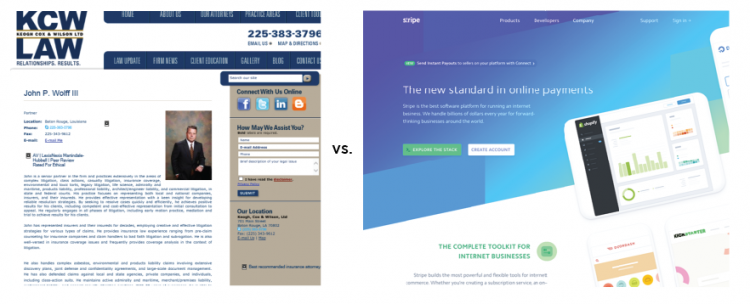
You’ve heard it many times that users don’t like clicking, scrolling and even don’t like reading. But what they definitely dislike is navigating through content-heavy and bulky websites. Your website is your business – it’s obvious you want to talk non-stop about it. Or write, or whatever other ways you may find to convey your message. Yet, poorly-organized content will affect its visual appeal. Often, it’s not even the size that makes your content bulky, but rather the way you segment your information and present it. Reducing your freshly-written content is always discouraging, so don’t hurry up to do it. Try visual and functional tactics instead.
User experience is extremely important for a website popularity. Are you sure your site’s information architecture, usability, interaction and visual design perform to the full potential? These steps will help you double-check.


